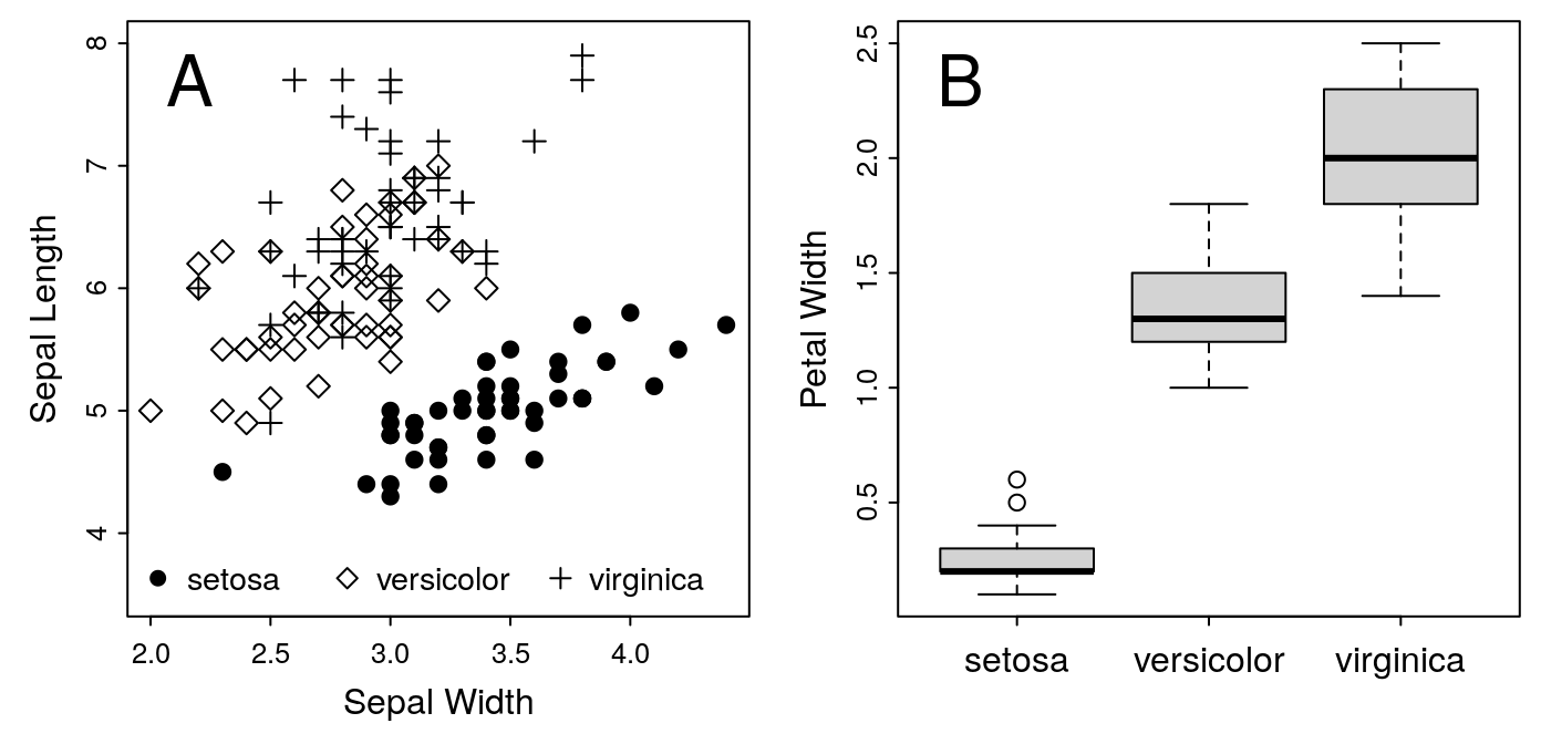
Figure 1: A. Iris Sepal Size by Species. B. Iris Petal Width
Introduction
Learning Objectives
At the end of this lesson, you should be able to:
- Customize plots produced with the R base graphics system
- Design multi-panel plots
- Design plots to suit the publication requirements of a journal
- Save your plots as high-resolution raster or vector image files as required by your publisher
Pre-requisites
You will need:
- A recent version of R installed on your computer
- Familiarity editing R scripts and passing commands from a script to the R interpreter
- Note that RStudio is not ideal for this lesson, due to limitations in how it processes plotting commands; the default RGui installed on Windows or Mac will work better
- These notes!
- Optionally, some of your own data to work with during the exercises
Motivation
You have several options for plotting with R. The simplest is the built-in or base graphics package. Base graphics are less powerful than newer alternatives like lattice or ggplot2. On the other hand, it’s much easier to customize base graphics than the others. For this reason, I prefer to use the built-in functions when preparing single-panel plots.
ggplot2 is definitely worth investigating, especially if you want to
produce complex multi-panel faceted plots. The official
website has all the documentation. Roger Peng has
also posted a very nice introductory video on
YouTube.
Building Our Plot
For this example, we’ll use the guidelines provided by the American Journal of Botany. AJB accepts figures 3.5 inches (1 column), 5-6 inches (1.5 columns), or 7.25 inches wide (2 columns). The height can be up to 9 inches. We’ll start with a one-column plot, so the dimensions should be 3.5 inches wide.
The figure we’ll plot is from the built-in iris data set. We’ll do a
simple scatterplot of Sepal.Length against Sepal.Width.
Size
Let’s start with a square. If we need more height, we can increase the size as necessary. Similarly, if we decide we need to stretch our figure over two columns, we can change later.
Note that RStudio isn’t the best environment for this exercise. Unfortunately, it’s not possible to create new plot windows in RStudio, so you can’t specify the dimensions of the figure for the on-screen display. Consequently, when you save your figure to an image file, you won’t necessarily get exactly what you see on the screen. In many cases, this may well be fine. But double-check the image file to make sure that you get what you expected. If you didn’t, it may be because the on-screen display and the saved image were not close enough to the same dimensions.
To set up the canvas for our plot, start a new device:
dev.new(height = 3.5, width = 3.5)If you are using RStudio, dev.new() won’t work. Instead, drag the edges
of the plot window to get as close to a 3.5" square as possible.
Content
Now that our canvas is ready, we can start placing our graphics. Let’s start with the default plot.
plot(Sepal.Length ~ Sepal.Width, data = iris)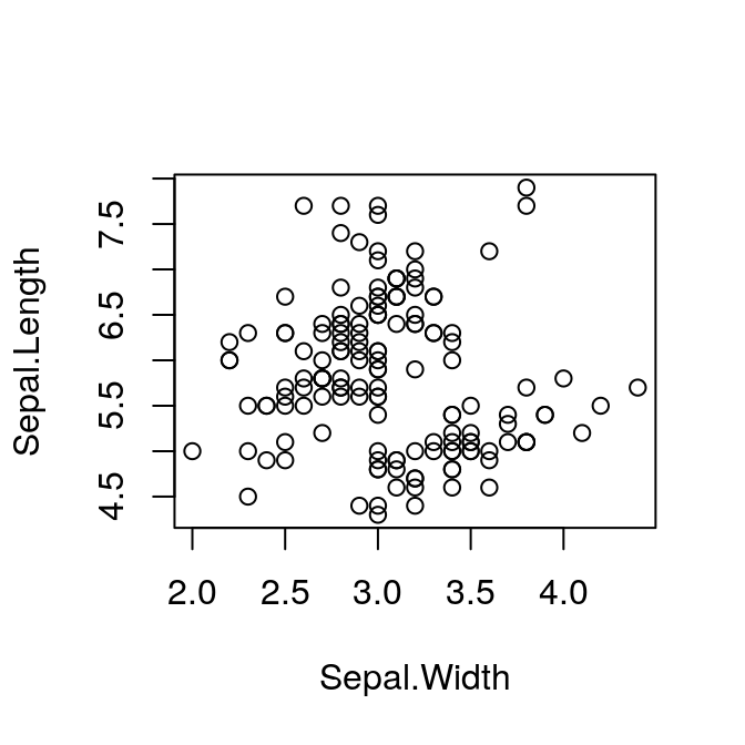
Plot Symbols
The default plot uses the same symbol for each point. However, our data frame includes samples from three different species:
str(iris)## 'data.frame': 150 obs. of 5 variables:
## $ Sepal.Length: num 5.1 4.9 4.7 4.6 5 5.4 4.6 5 4.4 4.9 ...
## $ Sepal.Width : num 3.5 3 3.2 3.1 3.6 3.9 3.4 3.4 2.9 3.1 ...
## $ Petal.Length: num 1.4 1.4 1.3 1.5 1.4 1.7 1.4 1.5 1.4 1.5 ...
## $ Petal.Width : num 0.2 0.2 0.2 0.2 0.2 0.4 0.3 0.2 0.2 0.1 ...
## $ Species : Factor w/ 3 levels "setosa","versicolor",..: 1 1 1 1 1 1 1 1 1 1 ...Recall that a factor is just a vector of integers, with each integer having it’s own label. We can display the underlying numbers by converting from factor to numeric:
as.numeric(iris$Species)## [1] 1 1 1 1 1 1 1 1 1 1 1 1 1 1 1 1 1 1 1 1 1 1 1 1 1 1 1 1 1 1 1 1 1 1 1 1 1
## [38] 1 1 1 1 1 1 1 1 1 1 1 1 1 2 2 2 2 2 2 2 2 2 2 2 2 2 2 2 2 2 2 2 2 2 2 2 2
## [75] 2 2 2 2 2 2 2 2 2 2 2 2 2 2 2 2 2 2 2 2 2 2 2 2 2 2 3 3 3 3 3 3 3 3 3 3 3
## [112] 3 3 3 3 3 3 3 3 3 3 3 3 3 3 3 3 3 3 3 3 3 3 3 3 3 3 3 3 3 3 3 3 3 3 3 3 3
## [149] 3 3This is a very useful feature. It means we can set a different plot symbol for each species:
plot(Sepal.Length ~ Sepal.Width, pch = as.numeric(Species),
     data = iris)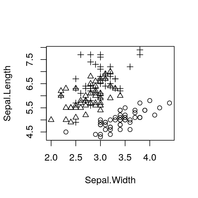
Margins
Now we can see what we’re working with, but the layout isn’t ideal. In
particular, the plot is very small relative to the size of the figure. We
can fix this with the mar parameter. mar takes a vector of four
integers, which set the width of the margin on the bottom, left, top and
right sides respectively (remember clockwise from the bottom!). These
numbers refer to the width of each margin in lines — i.e., the width
required for a single line of text. The default is c(5, 4, 4, 2) + 0.1.
The top margin in particular is usually too wide. We will very rarely add a
title to a published figure, so we don’t need to set aside space for it.
Set the value of mar with the par function.
par(mar = c(3, 3, 0.5, 0.5))
plot(Sepal.Length ~ Sepal.Width, pch = as.numeric(Species),
     data = iris)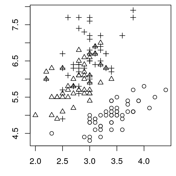
That’s better. But we’ve lost our axis labels. They aren’t actually lost, but they are plotted outside of the margins we’ve set, so they are no longer visible. I find the defaults that R uses for the axes to be larger than we need. Better to turn off the axes entirely and replot them ourselves.
Note that once the margins are set with par(), they will keep their value
until we open a new plot window, or reset them.
Axes
par(mar = c(3, 3, 0.5, 0.5))
plot(Sepal.Length ~ Sepal.Width, pch = as.numeric(Species),
     data = iris,
     ann = FALSE,      # turn off axis labels
     axes = FALSE)     # turn off axis ticks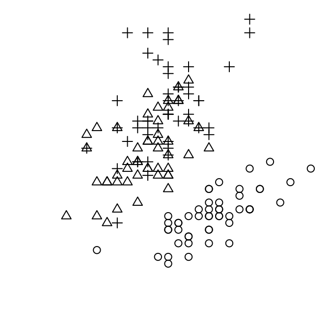
Notice that axes = FALSE has turned of the box around our plot. We can put it back easily:
box()Now we can explicitly add each axis with their size and placement specified:
axis(side = 1, tcl = -0.2, mgp = c(3, 0.3, 0),
     cex.axis = 0.8)
axis(side = 2, tcl = -0.2, mgp = c(3, 0.3, 0),
cex.axis = 0.8) 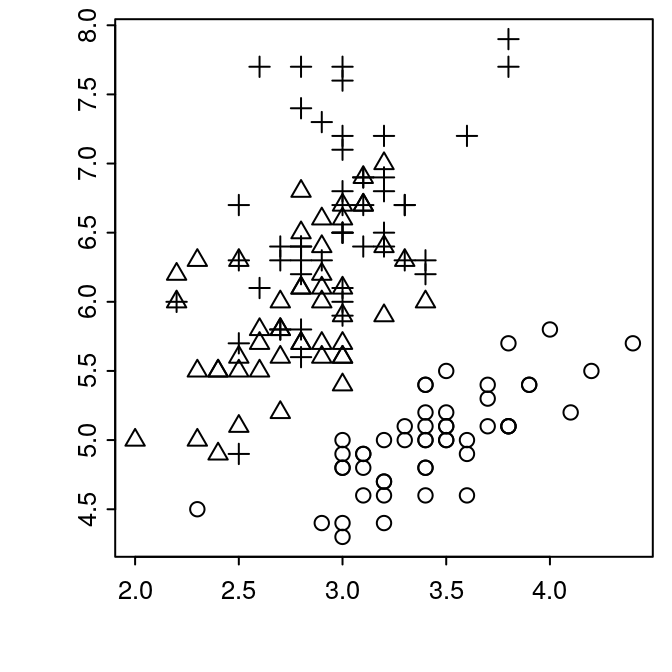
What just happened? Let’s breakdown the arguments to axis:
side:- which side of the plot, clockwise from bottom, same as for
marabove tcl:- length of the ticks. Negative values indicate extending outwards from plot, positive values extend inward. The default is -0.5, which I find a bit too long.
mgp:margin line, a vector of three numbers, which indicate the position of the axis title, axis labels, and axis line, respectively. The values are the number oflinesaway from the plot border to place each item, with0indicating the margin of the plot area. Note that title doesn’t matter here, since we aren’t using an axis title (yet).cex.axis:- axis character expansion. Scale the size of the tick labels. < 1 reduces the size, > 1 increases the size.
Now we can add our axis titles back in:
mtext("Sepal Width", side = 1, line = 1.5)
mtext("Sepal Length", side = 2, line = 1.5)
Here, we can use line to adjust the distance between the label text and the axis.
The finished plot
Putting this altogether gives us the following plot.
par(mar = c(3, 3, 0.5, 0.5))
plot(Sepal.Length ~ Sepal.Width, pch = as.numeric(Species),
     data = iris,
     ann = FALSE,      # turn off axis labels
     axes = FALSE)     # turn off axis ticks
box()
axis(side = 1, tcl = -0.2, mgp = c(3, 0.3, 0),
     cex.axis = 0.8)
axis(side = 2, tcl = -0.2, mgp = c(3, 0.3, 0),
     cex.axis = 0.8)
mtext("Sepal Width", side = 1, line = 1.5)
mtext("Sepal Length", side = 2, line = 1.5)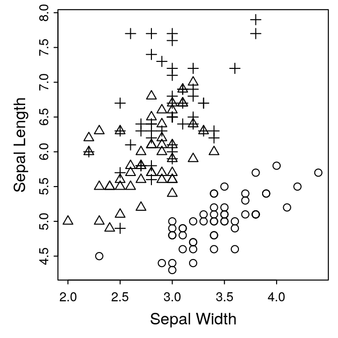
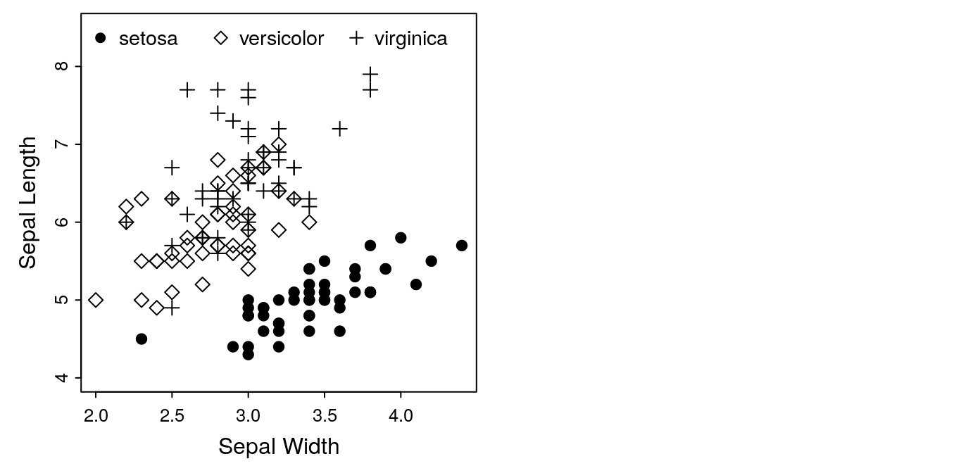
Exercise 1: adding a legend
We now have a complete figure. We could provide an explanation of the
symbols in the caption, but it might be nicer to have a legend plotted on
the figure. This is easily done with the legend() function.
legend(legend = levels(iris$Species), x="topleft",
       pch = 1:3)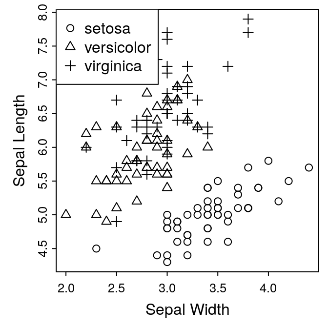
Since we set the pch argument in our plots using the factor
iris$Species, we can use levels() function to extract the labels for
the legend. pch indicates the actual symbols to use, and x is the
location of the legend.
This is clearly not “publication quality.” Our plot needs a bit more space for the legend. See if you can make an attractive plot. The following options might be helpful:
dev.new():width, heightplot():xlim, ylim, cexlegend():x, y, bty, horiz, cex, pt.cex, text.width
If you need a hint, take a look at the next section.
Additional Customization
Selecting Plot Symbols
If you want to select different symbols, it’s easy to do using R’s
subsetting syntax. By default, for three levels of our Species factor, we
get symbols 1, 2, and 3. If instead we wanted to use symbols1 19, 5, and
3, we could do this:
par(mar = c(3, 3, 0.5, 0.5))
mysymbols <- c(19, 5, 3)
plot(Sepal.Length ~ Sepal.Width,
     pch = mysymbols[as.numeric(Species)], data = iris,
     ylim = c(4.0, 8.5), ann = FALSE, axes = FALSE)
box()
axis(side = 1, tcl = -0.2, mgp = c(3, 0.3, 0),
     cex.axis = 0.8)
axis(side = 2, tcl = -0.2, mgp = c(3, 0.3, 0),
     cex.axis = 0.8)
mtext("Sepal Width", side = 1, line = 1.5)
mtext("Sepal Length", side = 2, line = 1.5)
legend(legend = levels(iris$Species), x = "top",
       pch = mysymbols, horiz = TRUE, bty = 'n',
       cex = 0.9, text.width = c(0.6, 0.7, 0.6))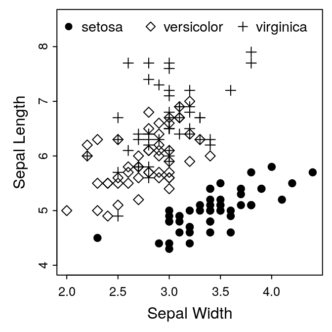
That’s an important application of R’s subsetting commands, so make sure
you follow what happened — we subset the mysymbols vector with the
longer as.numeric(iris$Species) vector, which converted the values from
(1, 2, 3) to (19, 5, 3):
mysymbols## [1] 19 5 3as.numeric(iris$Species)## [1] 1 1 1 1 1 1 1 1 1 1 1 1 1 1 1 1 1 1 1 1 1 1 1 1 1 1 1 1 1 1 1 1 1 1 1 1 1
## [38] 1 1 1 1 1 1 1 1 1 1 1 1 1 2 2 2 2 2 2 2 2 2 2 2 2 2 2 2 2 2 2 2 2 2 2 2 2
## [75] 2 2 2 2 2 2 2 2 2 2 2 2 2 2 2 2 2 2 2 2 2 2 2 2 2 2 3 3 3 3 3 3 3 3 3 3 3
## [112] 3 3 3 3 3 3 3 3 3 3 3 3 3 3 3 3 3 3 3 3 3 3 3 3 3 3 3 3 3 3 3 3 3 3 3 3 3
## [149] 3 3mysymbols[as.numeric(iris$Species)]## [1] 19 19 19 19 19 19 19 19 19 19 19 19 19 19 19 19 19 19 19 19 19 19 19 19 19
## [26] 19 19 19 19 19 19 19 19 19 19 19 19 19 19 19 19 19 19 19 19 19 19 19 19 19
## [51] 5 5 5 5 5 5 5 5 5 5 5 5 5 5 5 5 5 5 5 5 5 5 5 5 5
## [76] 5 5 5 5 5 5 5 5 5 5 5 5 5 5 5 5 5 5 5 5 5 5 5 5 5
## [101] 3 3 3 3 3 3 3 3 3 3 3 3 3 3 3 3 3 3 3 3 3 3 3 3 3
## [126] 3 3 3 3 3 3 3 3 3 3 3 3 3 3 3 3 3 3 3 3 3 3 3 3 3Panels
ggplot2 provides a very sophisticated system for producing multi-panel
plots. But it’s easy enough to create a simple panel using the base
graphics. For this example, let’s do a two-plot horizontal panel, with our
scatter plot in the first position, and a boxplot of petal widths in the
second position. A two-column plot in AJB is 7.25 inches wide:
dev.new(width = 7.25, height = 3.5)Next we need, to inform R that we’re splitting the figure into two panels:
par(mfrow = c(1, 2))mfrow sets the graphics device for rows and columns, in this case one
row, two columns. We can now put our first plot in the first spot:
After dividing a plot device into panels with mfrow, the first high-level
plot (i.e., plot, boxplot etc.) command will be placed in the first
panel. All subsequent low-level plotting commands (i.e., legend, axis, mtext etc.) will be added to this same panel. When the next high-level
command is called, it will be placed in the next panel, and focus shifts
with it. So we can now add our boxplot to the second panel:
boxplot(Petal.Width ~ Species, data = iris)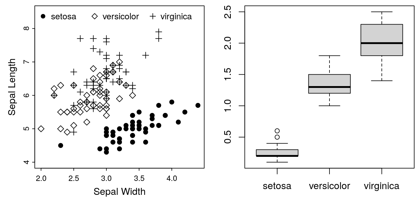
Note that the margins we set for the first panel are still in effect. Consequently, we’ve lost the axis labels on our second plot. It’s going to need some attention to make it look right. We’ll leave that for the next exercise.
In the meantime, we have one more requirement to meet. On multi-figure
panels, AJB requires an uppercase letter (A, B, etc) to label each plot.
This label should go in the upper-left corner of each panel. This is easy
to do with the text command. At the moment, we don’t have space in the
upper-left corner, so we’ll put the labels in the lower-right temporarily.
For example:
## For the first panel:
text("A", x = 4.2, y = 4.5, cex = 2)
## For the second panel:
text("B", x = 3.2, y = 0.24, cex = 2)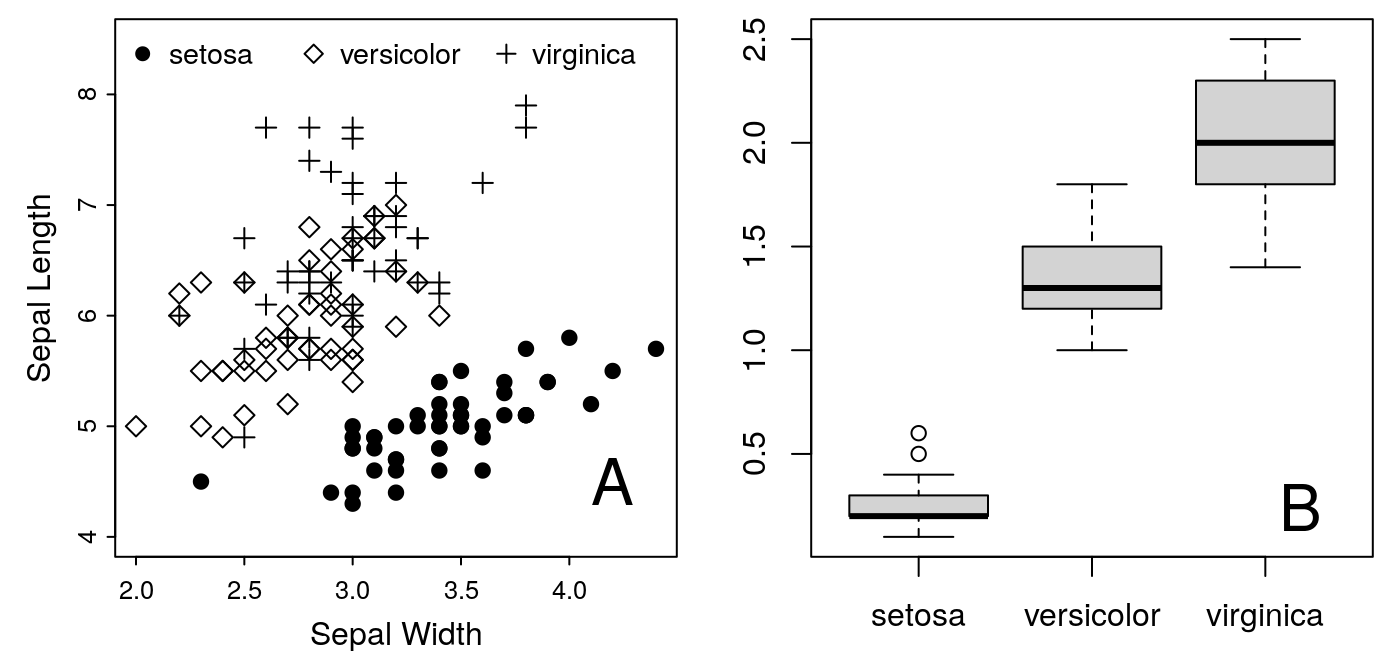
Unfortunately, each figure is plotted on different scales, so placing the letters in the same position is not straightforward. Luckily, R provides a function for getting “universal” coordinates for every plot.
## For the first panel:
text("A", x = grconvertX(0.9, from="npc", to="user"),
     y = grconvertY(0.1, from = "npc", to="user"), cex = 2)
## For the second panel:
text("B", x = grconvertX(0.9, from="npc", to="user"),
y = grconvertY(0.1, from = "npc", to="user"), cex = 2)The functions grconvertX and grconvertY convert between different
coordinate systems. npc is “normalized plot coordinates.” In this system,
(0, 0) is the lower left corner of the plot, and (1, 1) is the upper right
corner. user, on the other hand, is the coordinate system in effect for
the actual plotted data. Which, for our Panel A, means the lower right
corner is ca. (2.0, 4.0) and the upper left corner is ca. (4.5, 8.5). So
grconvertX(0.9, from = "npc", to = "user") returns the X coordinate to
plot our text 90% of the way to the left side of the plot, regardless of
the scale used in that plot. With this addition, we have the following
code, and the generated panels:
par(mfrow = c(1, 2))
par(mar = c(3, 3, 0.5, 0.5))
mysymbols <- c(19, 5, 3)
plot(Sepal.Length ~ Sepal.Width,
pch = mysymbols[as.numeric(Species)], data = iris,
ylim = c(4.0, 8.5), ann = FALSE, axes = FALSE)
box()
axis(side = 1, tcl = -0.2, mgp = c(3, 0.3, 0),
cex.axis = 0.8)
axis(side = 2, tcl = -0.2, mgp = c(3, 0.3, 0),
cex.axis = 0.8)
mtext("Sepal Width", side = 1, line = 1.5)
mtext("Sepal Length", side = 2, line = 1.5)
legend(legend = levels(iris$Species), x = "top",
pch = mysymbols, horiz = TRUE, bty = 'n',
cex = 0.9, text.width = c(0.6, 0.7, 0.6))
## For the first panel:
text("A", x = grconvertX(0.9, from="npc", to="user"),
y = grconvertY(0.1, from = "npc", to="user"), cex = 2)
boxplot(Petal.Width ~ Species, data = iris)
## For the second panel:
text("B", x = grconvertX(0.9, from="npc", to="user"),
     y = grconvertY(0.1, from = "npc", to="user"), cex = 2)
Exercise 2: Completing the Panel
There are still a few problems with our panel:
- The title of the Y axis on the second panel is not visible
- The panel labels (A and B) are in the wrong positions — they should be in the top left corners
- Fixing the panel labels will require moving the legend for the first figure
If you change ylim, you can put the legend on the bottom, and make space
for the label at the top. Go ahead and see what you can do with this. You
can use my example, Figure 1 at the top of this article as a model. There
is a trick to formatting the x-axis of boxplots. When calling the function
axis, you’ll have to set the at argument to indicate where to plot the
labels (which should be c(1, 2, 3), and you’ll have to set the labels
argument to indicate what the labels should be.
Alternatively, try formatting your own data according to the requirements of a journal in your field.
Image Formats
R can save graphics to a variety of formats, including anything your target journal might require. In general, you can store your images in one of two classes of file format:
- raster:
- images are stored as a matrix of values, with each value indicating the color of a single pixel in the grid. Best used for photographs. Examples: jpg, tiff, png.
- vector:
- images are stored as a series of mathematical instructions for re-creating the display: lines, polygons, text etc. Best used for line drawings. Examples: eps, svg.
Raster Images
Raster images are stored as a grid of numbers called pixels. Each number records the colour of a single pixel in the image. As a consequence, the image resolution is limited by the number of pixels recorded in the file. In our example, we need a figure 3.5 inches wide. AJB requires a resolution of 1000 dots per inch (DPI) for line drawings, which means we need a source image 3500 pixels in the x and y dimension. We don’t actually need to do these calculations, though, R will handle it for us. We just need to pick a format and set the final resolution.
AJB prefers TIFF format for raster files. To generate one we will use the
tiff() function. Note that this function only sets the file details for
our plot; we need to add the plotting code after we open the file, and
close it when we’re done with dev.off().
tiff(filename = "iris.tiff", width = 3.5, height = 3.5,
     units="in", res = 1000, compression = "lzw")
par(mar = c(3, 3, 0.5, 0.5))
plot(Sepal.Length ~ Sepal.Width, pch = as.numeric(Species),
     data = iris,
     ann = FALSE,      # turn off axis labels
     axes = FALSE)     # turn off axis ticks
## Insert additional plot code here
dev.off()width, height and units set the size of the image, res sets the
resolution in points per inch. compression reduces the size of the file.
The lzw options is only available for tiff files. It’s lossless, which
means the compressed image is just as good as the original, so there’s no
reason not to use it. In this case, it reduces the file size from 36Mb to
366K — a 99% reduction!
To create the same image as a jpg with the same resolution we’d use:
jpeg(filename = "iris.jpg", width = 3.5, height = 3.5,
     units = "in", res = 1000, quality = 85)
## insert plot code here!
dev.off()
jpg files are always compressed, and they use a lossy compression. That
means there is some degradation of the image quality associated with the
compression. The quality argument determines how aggressively the image
is compressed. Higher values produce larger, less-degraded images. As a
rule of thumb, 85 usually produces fine images at a reasonable size. In
this case, the file is 550K, so a little larger than the compressed TIFF
file.
Vector Images
Vector images are stored as a list of instructions: ‘draw a line from here to here, put a circle at this coordinate’ etc. As a consequence, they don’t have an inherent resolution; rather, they can be printed at any resolution necessary. So we don’t worry about the resolution when creating them, just the size and width. There are other options we need to be concerned with here:
- paper:
"special"indicates that we are making a single image, not a full-page- onefile:
FALSEindicates that we are making a new file for each image (probably not necessary with a single image)
horizontal:
:FALSE indicates we don’t want a landscape-orientation
To create an eps file:
postscript("iris.eps", height = 3.5, width = 3.5,
           paper = "special", onefile = FALSE,
           horizontal = FALSE)
## insert plot code here!
dev.off()
This file is only 11K, and can be printed at any resolution. That makes
eps a very convenient format to use. However, you may run into issues
with fonts. By default, eps files produced by R don’t include the fonts,
just the position of the letters to place on the image. If you need to
embed the fonts, you need to explicitly request this:
embedFonts("iris.eps", outfile="iris-embed.eps")This command creates a new file, iris-embed.eps, that has the font
information embedded in the file. Fonts can be tricky, and specific details
vary between Windows, Mac and Linux. It’s easiest to stick to the default
font settings, and only dive into custom fonts and settings if you are
required by the publisher.
Note that, pdf files are more common than eps. You can create pdf
image files directly from R as well, using:
pdf("iris.pdf", height = 3.5, width = 3.5,
    paper = "special", onefile = FALSE)
## insert plot code here!
dev.off()
How did I pick 19, 5 and 3? You can see all 25 symbols with
plot(1:25, pch = 1:25).↩︎