Admixture is a program for completing STRUCTURE-style analyses of large SNP datasets, such as we get with GBS (Elshire et al. 2011). This short tutorial covers getting our SNP data from STACKS (Rochette, Rivera‐Colón, and Catchen 2019) into a format that Admixture will understand, running the analysis, and importing the results into R for further investigation & plotting.
Converting Stacks Output to Admixture Input
Both Stacks and Admixture can process
PLINK data. However, there
are a few ‘gotchas’ that took a while to sort out. The simplest way I found
to bridge the two programs was to export my Stacks data to vcf, clean it
up on the command line, and then use the plink program to convert it to a
plink file that Admixture could parse.
I’ll start from the vcf file generated by Stacks’
populations
program. We expect to have thousands of contigs in a typical GBS dataset,
and each of which is numbered in the Stacks output:
head -20 populations.haps.vcf##fileformat=VCFv4.2
##fileDate=20210531
##source="Stacks v2.3e"
##INFO=<ID=AD,Number=R,Type=Integer,Description="Total Depth for Each Allele">
...
##FORMAT=<ID=GT,Number=1,Type=String,Description="Genotype">
##INFO=<ID=loc_strand,Number=1,Type=Character,Description="Genomic strand the co
#CHROM POS ID REF ALT QUAL FILTER INFO FORMAT NIAP1-1011 NIAP1-0342
26 1 . TTTCG TATCG . PASS snp_columns=61,93,136,137,177 GT 0/0 0/0
46 1 . AAAGTT AACATT . PASS snp_columns=13,15,48,73,125,192 GT 0/1 0/1
103 1 . CCCACATGATACGCCGC CCCATATAAGCCGCCGC . PASS snp_columns=11,16
149 1 . ACACTGT ACATTGT . PASS snp_columns=47,66,84,91,121,126,163 GT 0/0
271 1 . CATTGTGCGGAATATGT TACCTCATTTGCATTAC,CATTGTGCGGAAAATGT . PASSThis causes a problem when we try to use plink, which won’t accept
#CHROM values higher than 21. To fix this, we need to append a letter to
the #CHROM numbers:
sed '/^[[:digit:]]/s/^/c/' populations.haps.vcf > popC.haps.vcfhead -20 mingan.haps.vcf##fileformat=VCFv4.2
##fileDate=20210531
##source="Stacks v2.3e"
##INFO=<ID=AD,Number=R,Type=Integer,Description="Total Depth for Each Allele">
...
##FORMAT=<ID=GT,Number=1,Type=String,Description="Genotype">
##INFO=<ID=loc_strand,Number=1,Type=Character,Description="Genomic strand the co
#CHROM POS ID REF ALT QUAL FILTER INFO FORMAT NIAP1-1011 NIAP1-0342
c26 1 . TTTCG TATCG . PASS snp_columns=61,93,136,137,177 GT 0/0
c46 1 . AAAGTT AACATT . PASS snp_columns=13,15,48,73,125,192 GT 0/1
c103 1 . CCCACATGATACGCCGC CCCATATAAGCCGCCGC . PASS
c149 1 . ACACTGT ACATTGT . PASS snp_columns=47,66,84,91,121,126,163 GT
c271 1 . CATTGTGCGGAATATGT TACCTCATTTGCATTAC,CATTGTGCGGAAAATGT . PASSWith that small addition, we can now create a plink file with the plink
program:
plink --vcf popC.haps.vcf --make-bed --out pop.admix --allow-extra-chr 0This generates a few files: pop.admix.bed, pop.admix.bim,
pop.admix.fam, pop.admix.log, pop.admix.nosex.
Running Admixture
We can now run admixture itself. We need all the files generated by plink
together in the same directory. We’ll pass the .bed file as an argument
to Admixture, but it will look for the other files when it’s running.
The other key argument for admixture is the number of clusters to look for. We most likely will want to try a range of different values, in order to determine the optimal number (if there is one). We can do this in bash with a loop:
for K in `seq -w 1 20`
do
    admixture --cv pop.admix.bed $K > ktests/k${K}.out
done
The seq command generates a sequence of numbers, and the -w flag tells
it to pad the numbers with zeros (i.e., 01, 02, … 19, 20).
The --cv flag tells admixture to calculate cross-validation error rates,
which we will use to determine the optimal K value.
We direct the output to files in the directory ktests. Make sure this
directory exists before you start.
Once the loop is finished, we’ll want to examine the results:
grep -h CV ktests/*outCV error (K=1): 0.39835
CV error (K=2): 0.31327
CV error (K=3): 0.26516
CV error (K=4): 0.19929
CV error (K=5): 0.18499
...Now we’re ready to move into R to explore the results.
R Plotting
First, we’ll take a look at the CV values. Since they’re scattered in 20 different log files, we’ll use grep to collect them into a single file:
grep -h CV ktests/*out > CV.csvWe can load that into R:
CVs <- read.table("CV.csv", sep = " ")
CVs <- CVs[, 3:4] ## drop the first two columns
## Remove the formatting around the K values:
CVs[, 1] <- gsub(x = CVs[, 1], pattern = "\\(K=",
                replacement = "")
CVs[, 1] <- gsub(x = CVs[, 1], pattern = "\\):",
                replacement = "")
head(CVs)
## V3 V4
## 1 1 0.39835
## 2 2 0.31327
## 3 3 0.26516
## 4 4 0.19929
## 5 5 0.18499
## 6 6 0.15408plot(CVs, xlab = "K", ylab = "CV error")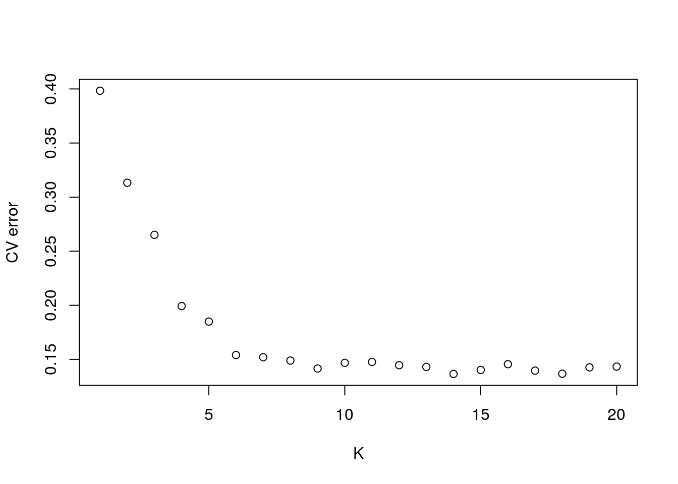
In our case, there isn’t a real clear optimum. K = 9 is about the bottom of the ‘elbow,’ we’ll use that to make our plot.
ad9 <- read.table("pop.admix.9.Q")
head(ad9)
## V1 V2 V3 V4 V5 V6 V7 V8 V9
## 1 0.000010 1e-05 1e-05 1e-05 1e-05 0.999920 1e-05 1e-05 1e-05
## 2 0.000010 1e-05 1e-05 1e-05 1e-05 0.999920 1e-05 1e-05 1e-05
## 3 0.000010 1e-05 1e-05 1e-05 1e-05 0.999920 1e-05 1e-05 1e-05
## 4 0.000010 1e-05 1e-05 1e-05 1e-05 0.999920 1e-05 1e-05 1e-05
## 5 0.020244 1e-05 1e-05 1e-05 1e-05 0.979686 1e-05 1e-05 1e-05
## 6 0.003441 1e-05 1e-05 1e-05 1e-05 0.996489 1e-05 1e-05 1e-05We also need a popmap file to annotate our plot. This file lists the
population of every sample, and critically, it must be in the same order as
the rows in pop.admix.9.Q. In this case, I’ll use the popmap data that I
used with the populations program to generate the original vcf files we
started wtih, with an additional column added with the population names in
it.
popmap <- read.table("popmap.csv")
head(popmap)
## sample popnum popname
## 1 NIAP1-1011 1 Niapsikau1
## 2 NIAP1-0342 1 Niapsikau1
## 3 NIAP1-1004 1 Niapsikau1
## 4 NIAP1-1017 1 Niapsikau1
## 5 NIAP1-1014 1 Niapsikau1
## 6 NIAP1-0923 1 Niapsikau1At this point, the two tables are in the same order. Before I do any manipulations, I’ll combine them. This allows me to sort them in any order, and the names will stay associated with the correct samples.
ad9 <- cbind(popmap, ad9)
head(ad9)
## sample popnum popname V1 V2 V3 V4 V5 V6 V7
## 1 NIAP1-1011 1 Niapsikau1 0.000010 1e-05 1e-05 1e-05 1e-05 0.999920 1e-05
## 2 NIAP1-0342 1 Niapsikau1 0.000010 1e-05 1e-05 1e-05 1e-05 0.999920 1e-05
## 3 NIAP1-1004 1 Niapsikau1 0.000010 1e-05 1e-05 1e-05 1e-05 0.999920 1e-05
## 4 NIAP1-1017 1 Niapsikau1 0.000010 1e-05 1e-05 1e-05 1e-05 0.999920 1e-05
## 5 NIAP1-1014 1 Niapsikau1 0.020244 1e-05 1e-05 1e-05 1e-05 0.979686 1e-05
## 6 NIAP1-0923 1 Niapsikau1 0.003441 1e-05 1e-05 1e-05 1e-05 0.996489 1e-05
## V8 V9
## 1 1e-05 1e-05
## 2 1e-05 1e-05
## 3 1e-05 1e-05
## 4 1e-05 1e-05
## 5 1e-05 1e-05
## 6 1e-05 1e-05In my case, the samples aren’t in order, so I need to sort them prior to plotting:
ad9 <- ad9[order(ad9$popnum), ]Now we’re ready to plot:
barplot(t(as.matrix(ad9[, -1:-3])), col=rainbow(9),
        space = 0, xlab="Population", ylab = "Ancestry",
        border=NA, axisnames = FALSE)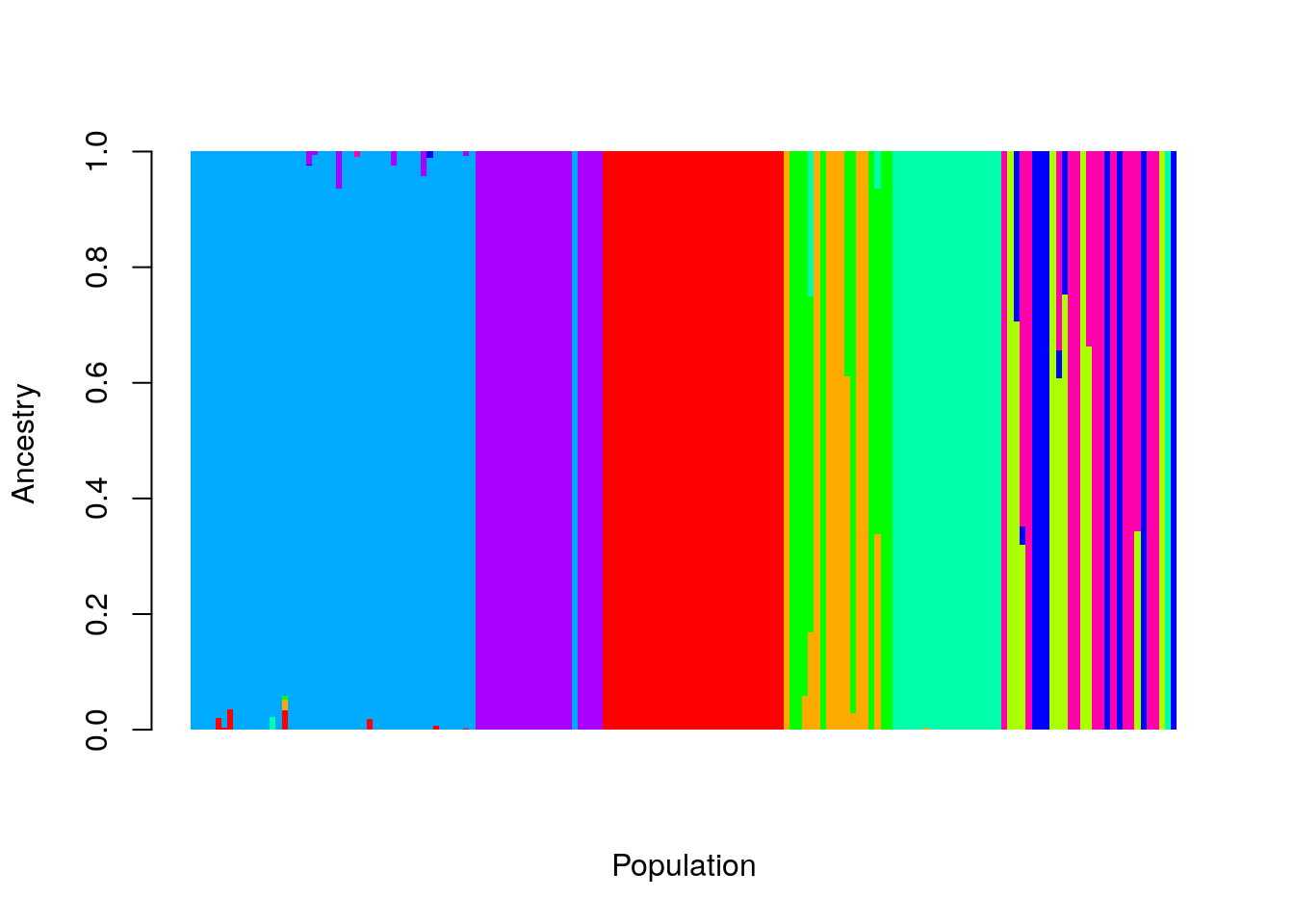
Let’s break that down. First, we excluded the first three columns, ad9[, -1:-3], so that we don’t include our labels in the data. Then we transpose
the matrix, so that each individual sample is represented by a column of
Ancestry proportions. I removed the borders on the bars, and the spaces
between them (border = NA, and space = 0), and set the axis labels.
That’s nice, but we’d like to label our original populations on the plot,
so we can see how they compare to the clusters produced by admixture. I use
the aggregate function for this.
xlabels <- aggregate(1:nrow(ad9),
                    by = list(ad9[, "popname"]),
                    FUN = mean)
xlabels
## Group.1 x
## 1 Fantome4 58.0
## 2 Fantome5 83.5
## 3 Havre6 107.5
## 4 Havre7 125.5
## 5 Marteau11 149.0
## 6 Niapsikau1 7.0
## 7 Niapsikau2 30.5Here, I’ve grouped the rows by population name, and then calculated the mean row number for each group. That will be handy, as I can then use that mean value to plot the name of each population centered beneath it.
Similarly, I can find the borders of the groups:
sampleEdges <- aggregate(1:nrow(ad9),
                        by = list(ad9[, "popname"]),
                        FUN = max)
sampleEdges
## Group.1 x
## 1 Fantome4 68
## 2 Fantome5 98
## 3 Havre6 116
## 4 Havre7 134
## 5 Marteau11 163
## 6 Niapsikau1 13
## 7 Niapsikau2 47In this case, I find the highest row for each population, which I’ll use to draw a line between them.
Putting this all together, we get:
barplot(t(as.matrix(ad9[, -1:-3])), col=rainbow(9),
        space = 0, xlab="Population", ylab = "Ancestry",
        border=NA, axisnames = FALSE)
abline(v = sampleEdges$x, lwd = 2)
axis(1, at = xlabels$x - 0.5, labels = xlabels$Group.1)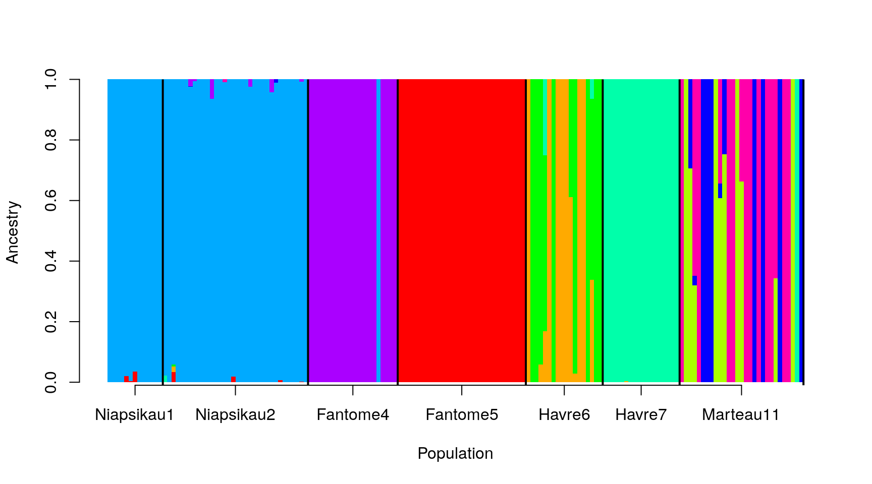
And we’re done!
See Also
For an alternative using ggplot2, see Luis D. Verde Arregoitia’s blog. There’s another tutorial that you might find helpful at SpeciationGenomics.github.io