My attempt to recreate the invasion stage analysis developed by Gallien et al. (2012), inspired by seeing it applied by Eckert et al. (2020). We’ll continue with the Lythrum salicaria data from my tutorial on niche quantification analysis. Specifically, I’ll model how the niche space this species occupies in its invaded range in North America relates to its global niche.
library(ecospat)
library(raster)
library(rgbif)
library(maptools)
library(magrittr)
library(dismo)
Gallien et al. (2012) used an ensemble of SDMs, which is (should be) more robust than applying a single approach. Nevertheless, for this short tutorial, I’ll stick to Maxent. I’m also cutting a lot of corners with respect to variable selection, model validation and other important steps. See my Maxent notebook for pointers.
Niche Models
We start by constructing SDMs for the global and North American distribution of L. salicaria.
Data
We need occurrence data and environmental data, and we’ll need to create background (pseudoabsence) samples.
The occurence data comes from GBIF, with details in my previous post:
load("../data/2021-07-29-ls-gbif-recs.Rda")
lsOccs <- lsGBIF$data

coordinates(lsOccs) <- c("decimalLongitude",
                        "decimalLatitude")
  ## Set the projection
crs(lsOccs) <- '+proj=longlat +datum=WGS84'
## NOTE: rgdal::checkCRSArgs: no proj_defs.dat in PROJ.4 shared filesdata(wrld_simpl) # load the maptools worldmap
par(mar = c(0,0, 0, 0))
plot(wrld_simpl, border = "gray80")
points(lsOccs, pch = 16, col = 2, cex = 0.3)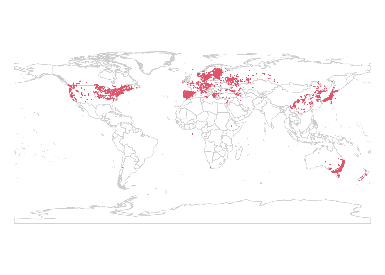
We’ll use the same climate data as well, sourced from WorldClim
(Fick and Hijmans 2017) and imported using functions provided in the raster
(Hijmans 2021) package. Note that I use the path argument to direct the
download to a particular location. This is the same location I used in the
previous post, and the data is still there, so it doesn’t get downloaded
again.
wclim <- getData("worldclim", var = "bio", res = 10,
                path = "../data")
We need to define our study extent for selecting background points. I’ll use a 200 km buffer around our observations. We’re working at the global scale, and Lythrum salicaria is a strong disperser, so a relatively large scale is appropriate here. You’ll need to consider the aims of your own study when setting your extent.
studyExtent <- buffer(lsOccs, 200000, dissolve = TRUE)## Loading required namespace: rgeos## NOTE: rgdal::checkCRSArgs: no proj_defs.dat in PROJ.4 shared files
## NOTE: rgdal::checkCRSArgs: no proj_defs.dat in PROJ.4 shared filesplot(wrld_simpl, border = "gray80")
plot(studyExtent, col = 'lightgreen', add = TRUE)
points(lsOccs, pch = 16, col = 2, cex = 0.3)
The 200 km buffer creates some isolated pockets in North America. The extent should represent the area the species can access. The buffer I made includes the west coast inwards to Alberta, the east coast inwards to Saskatchewan, with an isolated patch in the center of Canada which looks like it’s at the Alberta/Saskatchewan border, with similar ‘islands’ in the western US:
plot(wrld_simpl, border = "gray80", xlim = c(-135, -90),
ylim = c(45, 60))
plot(studyExtent, col = 'lightgreen', add = TRUE)
points(lsOccs, pch = 16, col = 2, cex = 1)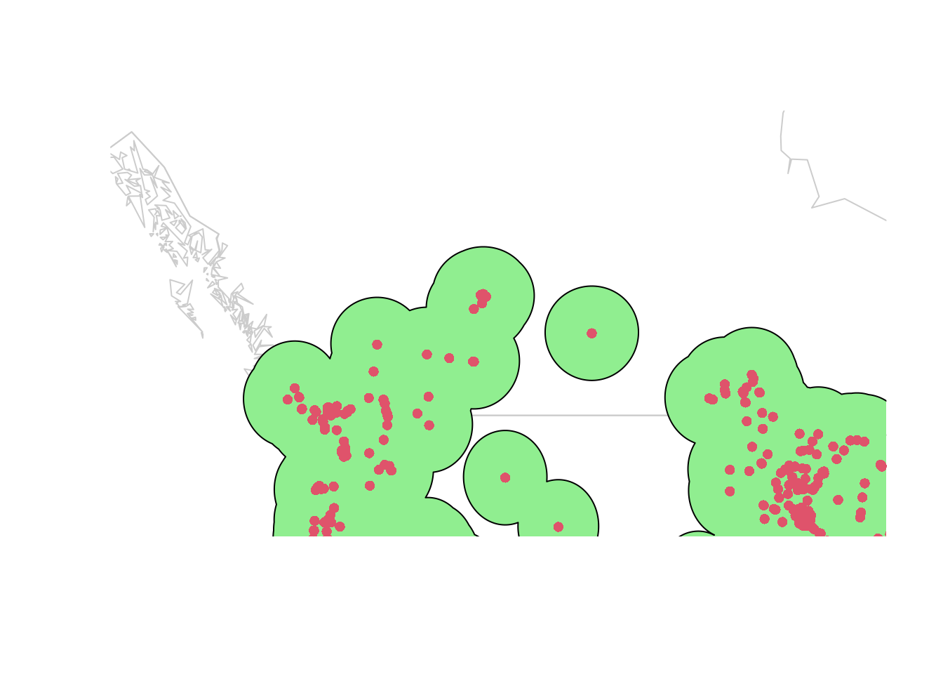
Those islands are likely the leading edge of the same invasion, not separate invasions! I’m going to increase our buffer to 300 km to capture the intervening area on the map:
studyExtent <- buffer(lsOccs, 300000, dissolve = TRUE)## NOTE: rgdal::checkCRSArgs: no proj_defs.dat in PROJ.4 shared files
## NOTE: rgdal::checkCRSArgs: no proj_defs.dat in PROJ.4 shared filesplot(wrld_simpl, border = "gray80")
plot(studyExtent, col = 'lightgreen', add = TRUE)
points(lsOccs, pch = 16, col = 2, cex = 0.3)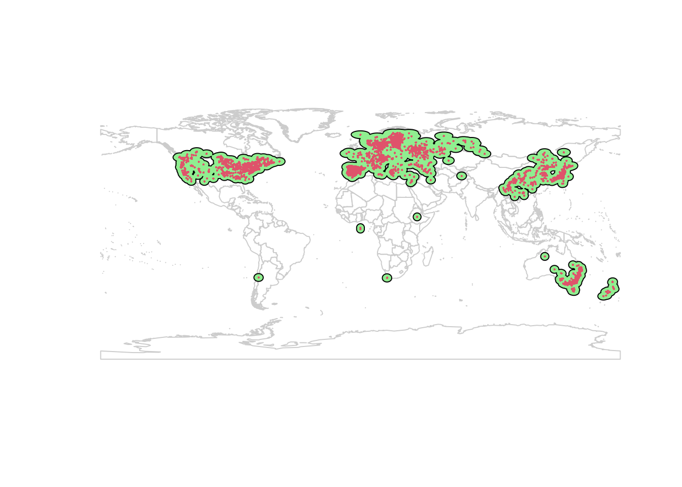
This is better. I prefer to use ecoregions to set study extent, but for the purposes of this demo I’ll continue with this.
One further issue: our study extent includes the ocean. Let’s trim it back to the land:
land <- aggregate(wrld_simpl) ## dissolve country borders
## clip buffer to land:
studyExtent <- intersect(studyExtent, land)
plot(wrld_simpl, border = "gray80")
plot(studyExtent, col = 'lightgreen', add = TRUE)
points(lsOccs, pch = 16, col = 2, cex = 0.3)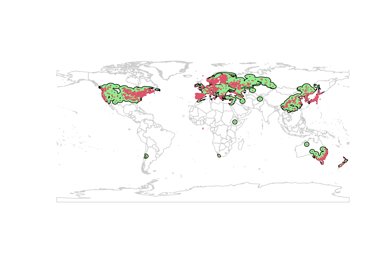
(This generates some warnings, likely related to missing values in my data or issues with the shapefile manipulations. It seems safe to proceed.)
The aggregation is a bit rough, but that should work for my purposes today. Now we can select our background points. I’m using 10000 points, and excluding any cells with a Lythrum salicaria occurrence.
  ## Convert landmass polygon to a raster:
landMask <- rasterize(land, wclim)

  ## sample points from the raster:
background <- randomPoints(landMask, n = 10000, p = lsOccs)
Global SDM
Now we can fit our Maxent model. To reduce bias, I’ll thin the samples to 5 observations per grid cell (ca. 20 km square). Normally I work on a finer resolution (1 km 2), and thin to 1 observation per cell. Again, the details depend on your study area and goals.
lsThin <- gridSample(lsOccs, wclim, n = 5) %>%
  as.data.frame

coordinates(lsThin) <-
  c("decimalLongitude", "decimalLatitude")
glMax <- maxent(wclim, p = lsThin, a = background)
glPred <- predict(glMax, wclim)
(Warnings here tell us that some of the occurrences are in locations where there is no climate data. That’s normal, and not a problem as long as there are only a few points lost this way. If you are working with small data sets, you’ll want to investigate further to see if you can better match your records with the climate rasters.)
Here’s the model prediction:
plot(glPred)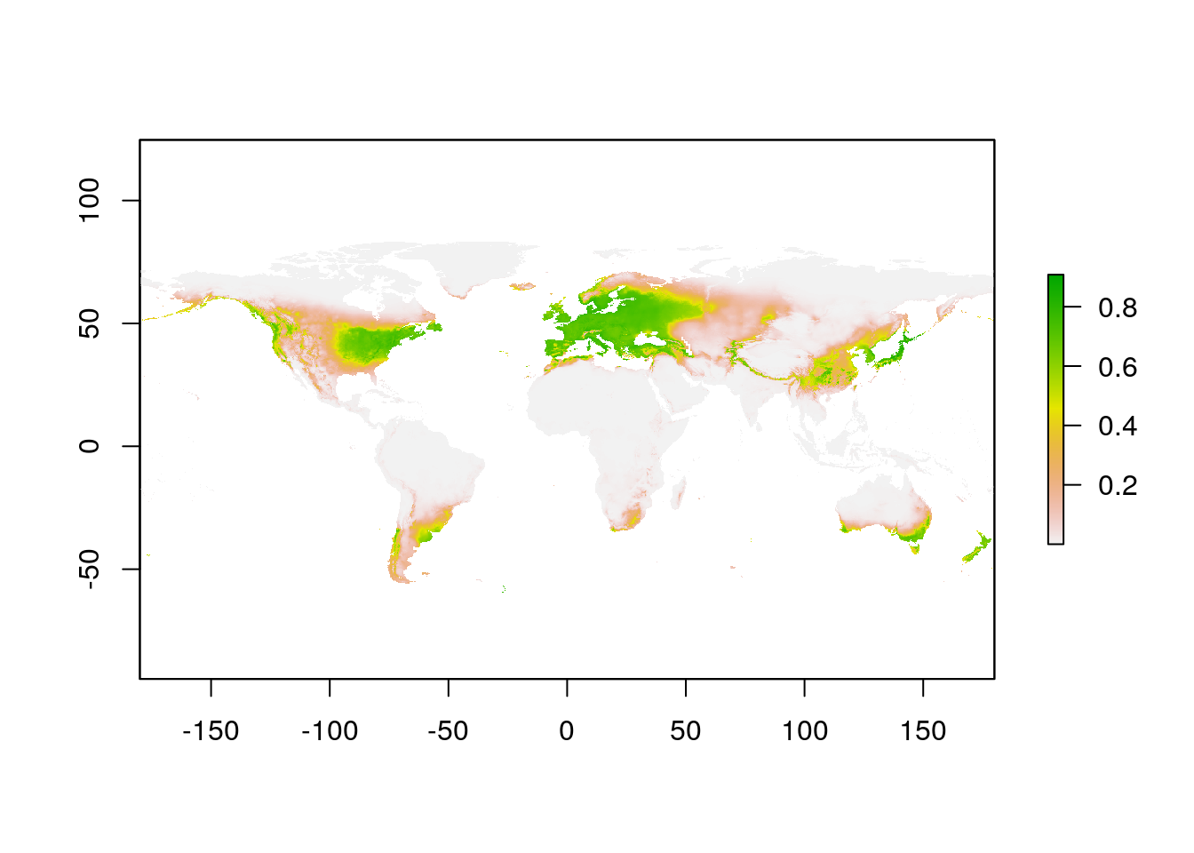
North America SDM
For the SDM in the invaded range in North America, we need to crop our
observations and background. Here I’m repeating the functions I used above
to create a raster mask for land, but applying it only to the area of
Canada, United States, and Mexico (our species isn’t in the Caribbean). I’m
using the pipe (%>%) feature from magrittr, which makes it easier to
follow the process.
NA_polygon <- wrld_simpl %>%
  subset(NAME %in%
         c("Canada", "United States", "Mexico")) %>%
  aggregate()

NA_mask <- rasterize(NA_polygon, wclim)

NA_background <-
  randomPoints(NA_mask, n = 10000, p = lsOccs) %>%
  as.data.frame()

coordinates(NA_background) <- c("x", "y")
In the original paper of Gallien et al. (2012), the background points were weighted using the values from the global model. I don’t think Eckert et al. (2020) applied this weighting, and it’s not clear to me how to do so with Maxent. For now I’ll skip it.
For the occurrence records, I’ll take my previously thinned data, and crop it to North America:
NA_polygon <- wrld_simpl %>%
  subset(NAME %in%
         c("Canada", "United States", "Mexico")) %>%
  aggregate()

lsNAThin <- intersect(lsThin, NA_polygon)
Now we can construct the SDM for North America:
naMax <- maxent(wclim, p = lsNAThin, a = NA_background)
naPred <- predict(naMax, wclim)
plot(naPred)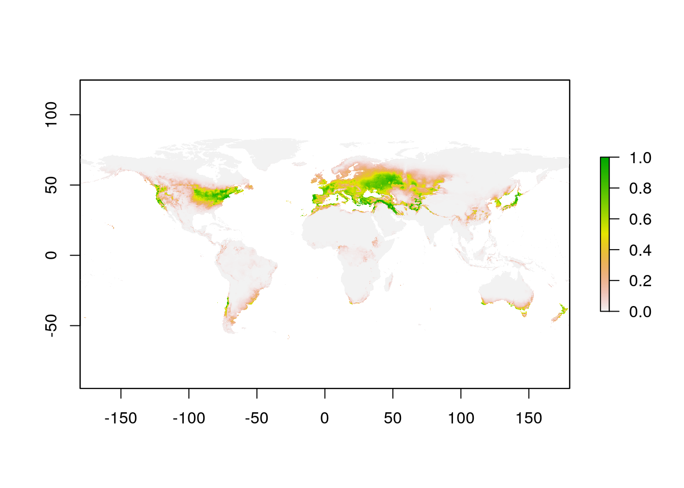
Note that I didn’t crop the WorldClim layer for the North American SDM model fitting. Maxent only uses the data for the presence and background points, so it doesn’t matter if the climate layers cover the whole planet for this step.
Invasion Stage Analysis
Now that we have completed both a global and a local (North America) SDM for L. salicaria, we’re ready to compare the results.
Niche Space
The values we need are the model predictions corresponding to each observation in North America.
globalVals <- extract(glPred, lsNAThin)
naVals <- extract(naPred, lsNAThin)

plot(naVals ~ globalVals, pch = 16, xlim = c(0, 1),
     ylim = c(0, 1),
     xlab = "Global model predictions",
     ylab = "Regional model predictions",
     col = "#00000050")
abline(h = 0.5, lty = 2)
abline(v = 0.5, lty = 2)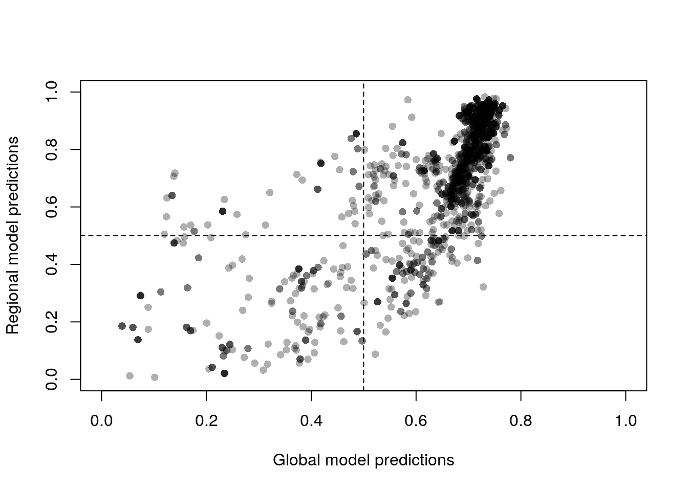
This plot compares the default Maxent output, the complementary log-log
value. This is an estimate of the probability of presence, which is more
appropriate than the other options for this kind of analysis (raw values
would be difficult to interpret). However, I’m not sure 50% is the most
appropriate value to use in the analysis that follows. Eckert et al. (2020)
used optim.thresh from the (now defunct) SDMTools package to determine
the best threshold for their study.
Following Gallien et al. (2012), we interpret the four quadrants of this plot as follows:
- Upper right
High suitability in both native and global habitat. Observations here are occupying locations that fall within both the global and invaded niche, interpreted as ‘stabilizing.’
- Upper left
High suitability in native model, but low suitability in the global model. Observations are occupying locations that are within the invaded niche, but outside the global niche, interpreted as populations demonstrating local adaption
- Lower right
High suitability in the global model, but low suitability in the local model. These are interpreted as regional colonizations: the conditions here are within the global niche, but which are only starting to be occupied in the invaded range.
- Lower left
Low suitability in both the local and global model. Presumably sink populations (not likely to persist).
Let’s tabulate the results:
tally <- c(stabilizing
          = sum(globalVals >= 0.5 & naVals >= 0.5,
                na.rm = TRUE),
          adapting = sum(globalVals < 0.5 & naVals >= 0.5,
                         na.rm = TRUE),
          sinks = sum(globalVals < 0.5 & naVals < 0.5,
                      na.rm = TRUE),
          colonizing = sum(globalVals >= 0.5 & naVals < 0.5,
                           na.rm = TRUE))

barplot(tally, ylab = "Occurences")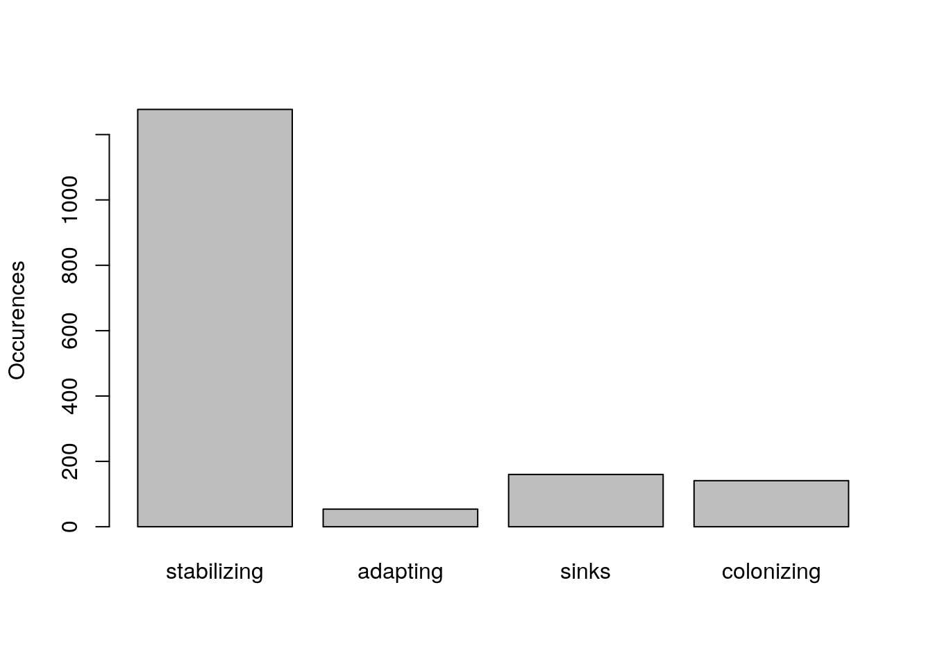
We can plot these regions on the map as well (apologies for the opaque raster algebra; there should be a clearer way to calculate this, but I can’t think of it at the moment).
suitabilityThreshold <- 0.5
na_Niche <- naPred > suitabilityThreshold
gl_Niche <- glPred > suitabilityThreshold

stable_Niche <- (na_Niche + gl_Niche) == 2
expansion_Niche <- ((2 * na_Niche) - gl_Niche) == 2
contraction_Niche <- ((2 * gl_Niche) - na_Niche) == 2

NicheRaster <- stable_Niche + (2 * expansion_Niche) +
  (3 * contraction_Niche)

plot(NicheRaster, xlim = c(-140, -60), ylim = c(30, 70),
     col = c("white", "blue", "red", "green"),
     legend = FALSE)
plot(wrld_simpl, add = TRUE)
points(lsNAThin, pch = 16, cex = 0.5)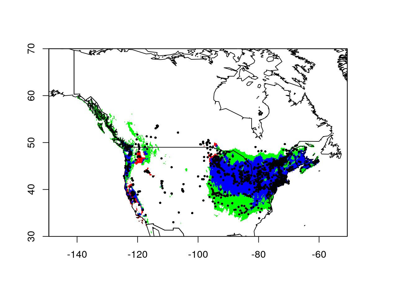
In this plot, the blue depicts areas identified as suitable habitat in both the global and regional model. The green is area identified as suitable habitat in the global model, but not the North American model. There are some occurrences in this area, but they aren’t as numerous as the blue regions. Finally, the red areas were identified by the North American model as suitable habitat but they were not part of the global model’s suitable habitat. Following Gallien’s framework, any points in the white areas would be ‘sinks.’ More likely they’re the current leading edge of the invasion front I think.
Obviously, there’s a lot going on here, and each of these steps will warrant careful consideration and additional checks, validations, and optimizations. I hope this simplified outline is enough to get you started.