Reference
This is an update of my previous mapping
tutorial. Spatial analysis in R is shifting to
terra and sf as the primary packages, so I’ve translated my old,
raster-based tutorial to the new workflow. See the RSpatial
tutorial for a more detailed
introduction/overview of using terra for GIS/spatial analysis.
The following tutorial walks through some common plotting tasks I use for distribution models.
Basemaps
The geodata package provides several convenient functions for downloading
raster and vector maps for use as basemaps and spatial analysis. The first
time you use these functions, they will download the requested maps from
the internet. It will save the data in your working directory, or in a
location specified with the path argument. The next time you request the
same data, if it finds them in the local directory (or the specified
path), they will be loaded from there, saving the time and bandwith
necessary to download them.
library(geodata)## Loading required package: terra## terra 1.7.29us <- gadm(country = "USA", level = 1, resolution = 2,
path = "../data/maps/")
canada <- gadm(country = "CAN", level = 1, resolution = 2,
path = "../data/maps")
mexico <- gadm(country = "MX", level = 1, resolution = 2,
path = "../data/maps")Countries are specified by their ISO code, which you can find by calling
the function country_codes(). The by default, country_codes() returns a
table of countries and the various ISO codes they have, as well as the
continents they are in. The query argument lets you filter this table on
any value. For example, you can get a table of North American countries
with:
country_codes("North America")or, just their ISO codes with:
country_codes("North America")$ISO3The other arguments allow you to select, national, subnational, or
subprovincial borders (level 1-3), the resolution (high: 1, low: 2),
and the path to the directory where you want the maps stored.
These maps can be plotted directly with the plot command. If you want to
combine them, use the add = TRUE argument to the second plot call:
plot(us, lwd = 2)
plot(canada, add = TRUE, col = 'red')
plot(mexico, add = TRUE, border = "green")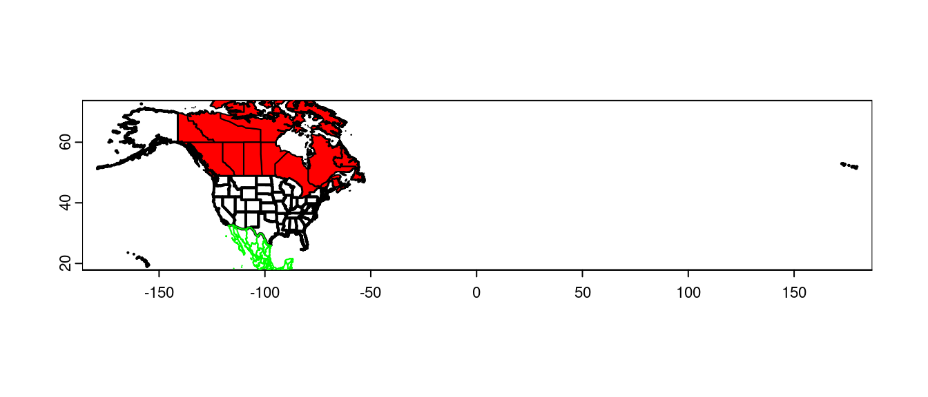
col sets the fill colour, border sets the outline color.
You can also request multiple countries as a single set of polygons, by
passing a character vector to the country argument.
NorthAmerica <- gadm(country = country_codes("North America")$ISO3,
                     level = 0, resolution = 2,
                     path = "../data/maps/")

plot(NorthAmerica, xlim = c(-180, -50))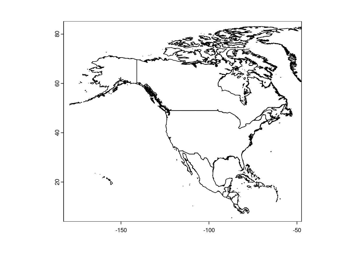
Note that xlim and ylim work as you would expect for plotting.
If you want to combine multiple polygons into a single object, use rbind:
CanUS <- rbind(us, canada)
plot(CanUS, xlim = c(-180, -50))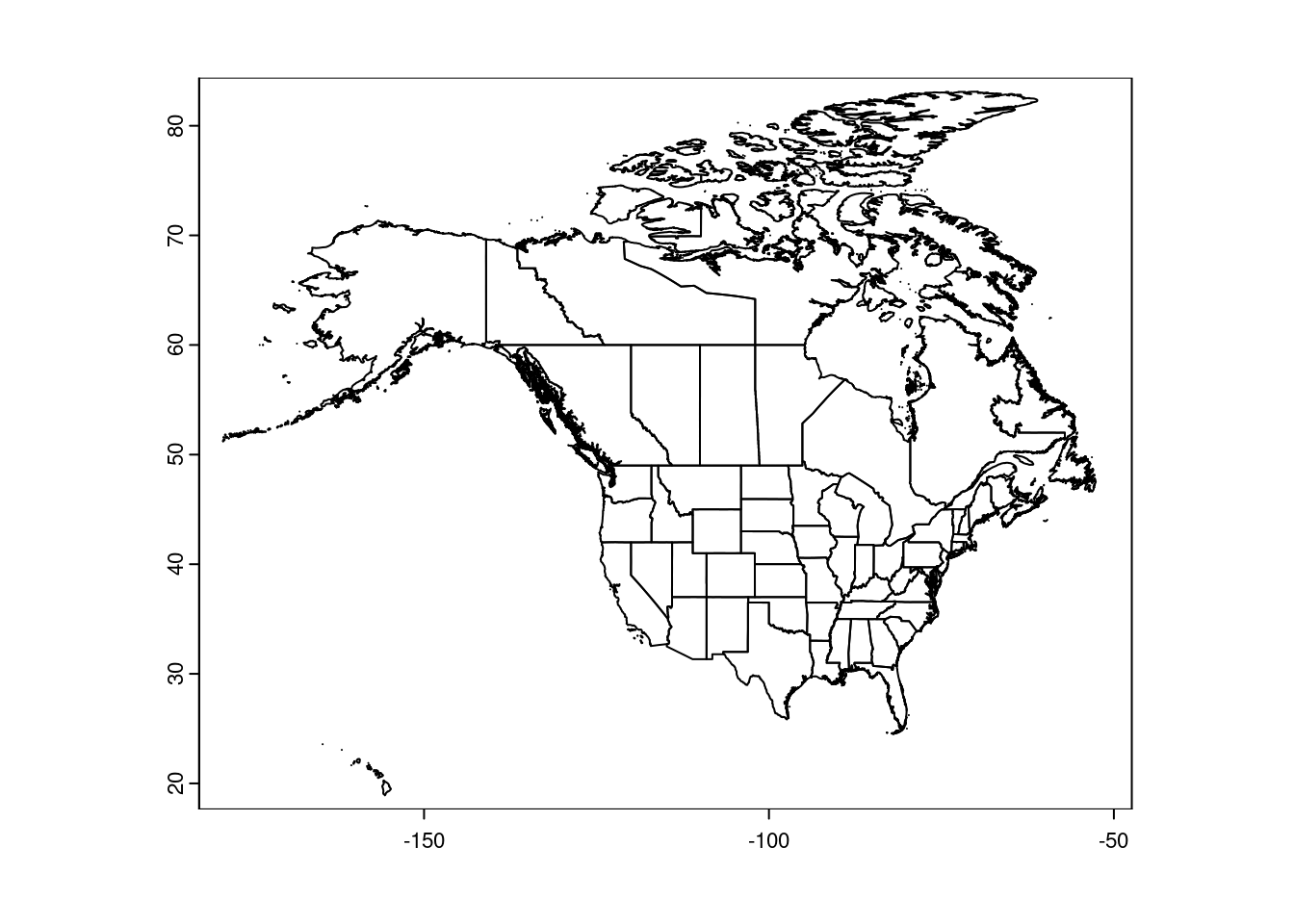
These maps are ‘unprojected’, meaning they are plotted in latitude/longitude degrees. That makes it easy to set the plot boundaries:
plot(CanUS, xlim = c(-100, -50), ylim = c(30, 60))
plot(NorthAmerica, lwd = 2, add = TRUE)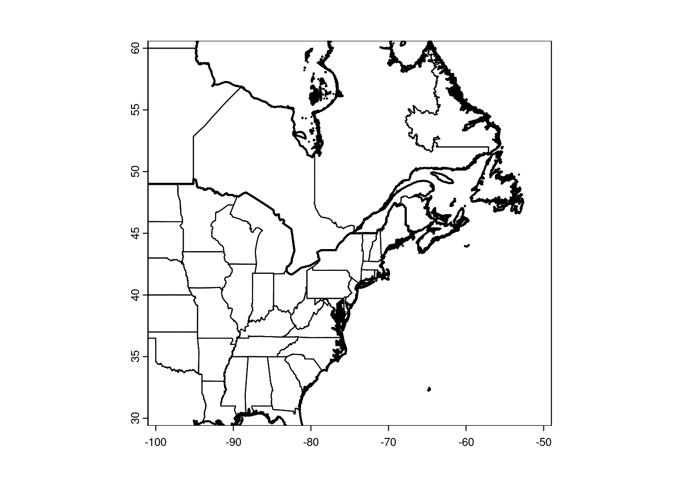
NB: The size of your plot canvas is fixed, but a map can’t stretch. The x and y dimensions have to maintain the same aspect. That means zooming in one dimension (i.e. latitude only) won’t necessarily change the zoom of your map, if the other dimension fills the canvas. You’ll have to play around with the plot size, and both x and y dimensions together, to tweak your zoom.
It’s handy to have a shapefile of the Great Lakes, for making prettier maps. I created this one in QGIS and use it for plotting:
greatlakes <- vect("../data/maps/greatlakes.shp")Adding Data
Vectors
You can add points to the plot like a regular scatter plot:
library(scales) ## for the alpha function below##
## Attaching package: 'scales'## The following object is masked from 'package:terra':
##
## rescalegbif <- read.table("../data/trich-gbif.csv")
## Set the line color to gray to focus on the data points:
plot(CanUS, xlim = c(-100, -50), ylim = c(30, 60),
border = "gray")
points(gbif$X, gbif$Y, pch = 16,
col = alpha("green", 0.2))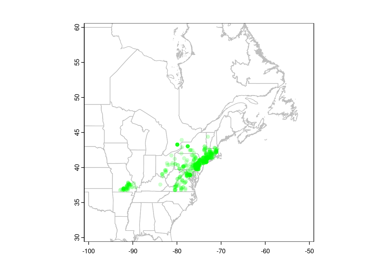
You can also convert your points to a spatial vector object, in which case R will know which columns to use for plotting. This is also necessary before we can project our data (see below).
gbif <- vect(gbif, geom = c("X", "Y"))
## plot(CanUS, xlim = c(-100, -50), ylim = c(30, 60),
##      border = "gray")
## points(gbif, pch = 16, col = alpha("green", 0.2))
Subsetting vectors
You often need to select polygons that contain points, or select only those
points that occur within a particular polygon. You can do this with R’s [
subsetting syntax. For instance, <polygons>[<points>, ] will select
polygons that contain one or more points:
plot(CanUS, xlim = c(-100, -50), ylim = c(30, 60),
      border = "gray")
## Select states and provinces where Trichophorum is
## present:
plot(CanUS[gbif, ], col = 'red', add = TRUE)
points(gbif, pch = 21, col = 'white', bg = 'black')
Conversely, <points>[<polygons>, ] will select points that are within
polygons. In this example, we’ll use the fact that our CanUS SpatVector
object has a column named NAME_1 that holds the name of the state or
province of each polygon:
plot(CanUS, xlim = c(-100, -50), ylim = c(30, 60),
      border = "gray")
plot(CanUS[gbif, ], col = 'red', add = TRUE)
## Select only points in NY state:
points(gbif[CanUS[CanUS$NAME_1 == "New York", ], ],
       pch = 21, col = 'white', bg = 'black')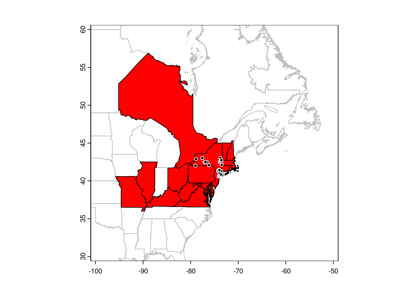
Rasters
Similarly, you can plot rasters with plot:
trichPreds <- rast("../data/trichPreds.grd")
plot(trichPreds, xlim = c(-100, -50), ylim = c(30, 60))
plot(CanUS, border = "gray", lwd = 0.5, add = TRUE)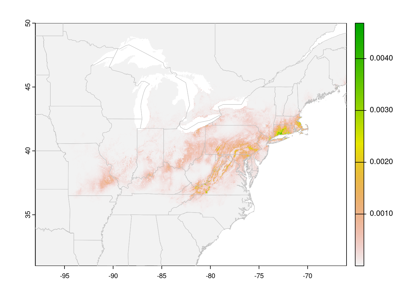
Cells with NA values are transparent. In this case, a species
distribution model, low values are displayed in gray. This may be useful
for visualizing the extent of the model. However, it looks a bit odd, and
makes it hard to see limits of the high-suitability areas. You can tweak
this by playing with the color ramp, but it’s also handy to ‘turn off’ the
low values entirely (for visualization, not for analysis!!)
trichPredsTrim <- trichPreds
trichPredsTrim[trichPredsTrim <
               quantile(values(trichPreds),
                        probs = 0.75, na.rm = TRUE)] <- NA
plot(trichPredsTrim, xlim = c(-100, -50), ylim = c(30, 60))
plot(CanUS, border = "grey", add = TRUE)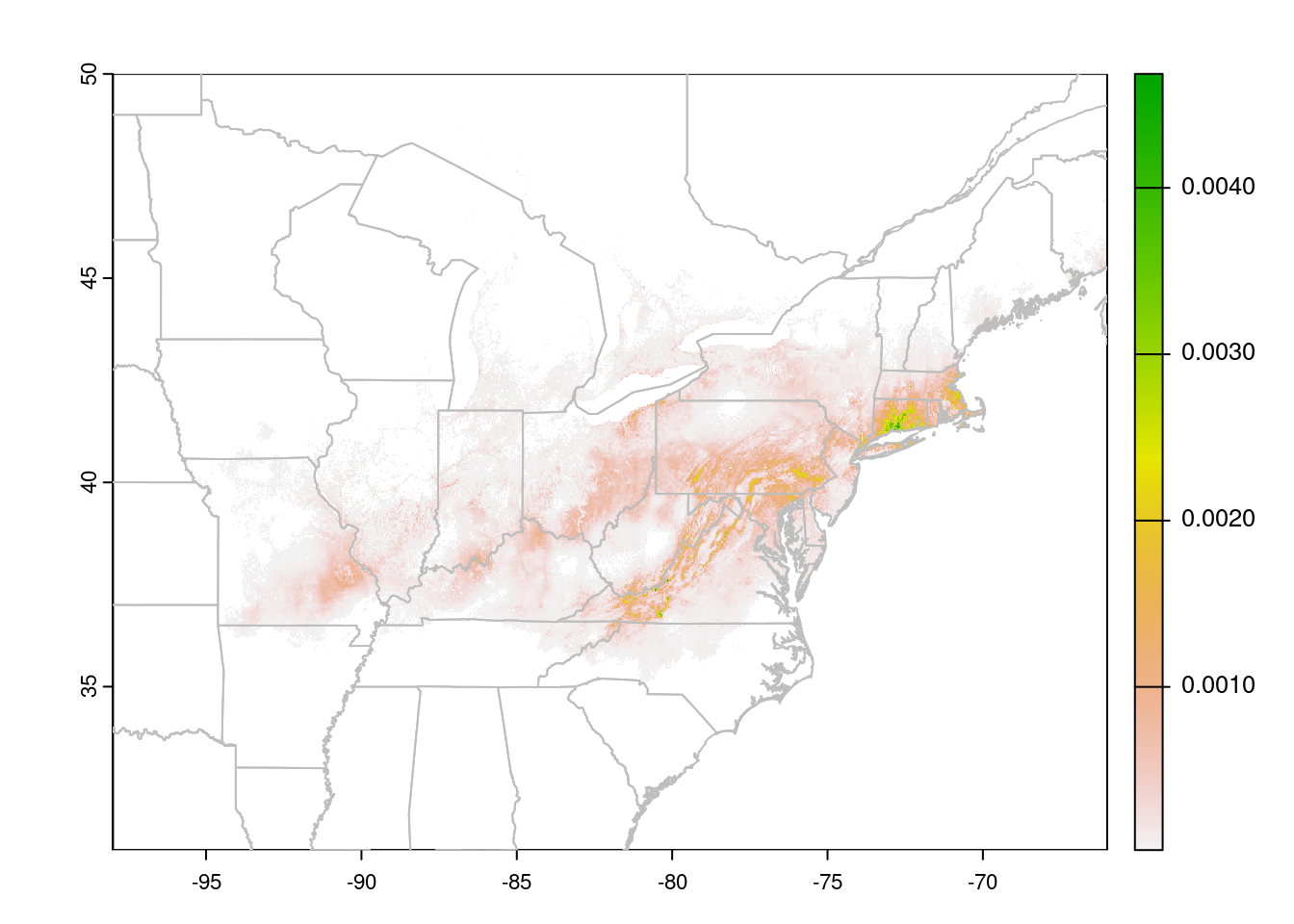
The test I used here, trichPredsTrim < quantile(getValues(trichPreds), probs = 0.75, na.rm = TRUE) identifies all cells in the lower 75% of the
suitability scores, which I then set to NA to make them invisible. I
decided on 75% after experimenting with different values. In this case, 75%
drops most of the grey background (the very lowest values), without eating
into the areas that the prediction indicates are suitable.
You could also use an absolute value here, but then you’d need to know the
actual distribution of the suitability scores. quantile is easier to
tweak.
Alternatively, you can assign colours to the prediction raster based on the value of each pixel, after splitting them into categories:
suitability <- extract(trichPreds, gbif, ID = FALSE)[, 1]

predCat <- (trichPreds > quantile(suitability, 0.25)) +
  (trichPreds > quantile(suitability, 0.15)) +
  (trichPreds > quantile(suitability, 0.05)) +
  (trichPreds > quantile(suitability, 0.025))

predCols <- c("white", "grey95", "yellow3", "orange", "red")

plot(predCat, xlim = c(-100, -50), colNA = 'lightblue',
     col = predCols, ylim = c(30, 60), legend = FALSE)
plot(CanUS, border = "grey", add = TRUE)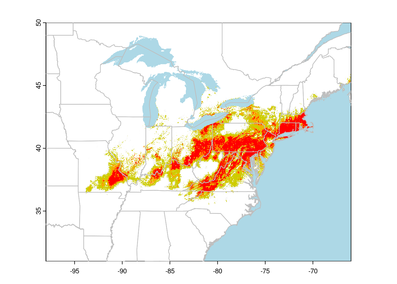
I find using a small number of categories makes it easier to read the suitability map than trying to interpret the colour gradients usually used.
Projections
Lat/Lon maps look a bit square; we’re more used to seeing maps projected. A common projection for Canada is Lambert Conformal Conic. We can transform our data to this projection to make nicer maps:
## define the projection
canlam <- "+proj=lcc +lat_1=49 +lat_2=77 +lat_0=49 +lon_0=-95 +x_0=0 +y_0=0 +datum=NAD83 +units=m +no_defs"

## project our vector data:
CanUS.lcc <- project(CanUS, canlam)
gl.lcc <- project(greatlakes, canlam)

## Now we to set the projection of our points:
crs(gbif) <- "+proj=longlat +datum=WGS84"

## Finally, we can project our points to LCC:
gbif.lcc <- project(gbif, canlam)
Note that our data needs to be in an object of class Spat*, and it must
have a defined coordinate reference system (CRS) before we can project it
to a new CRS. The crs function allows us to explicitly set the
projection. See the RSpatial
tutorial for more
details on specifying CRS with terra.
The same function works for rasters (sort of):
rasterLCC <- project(trichPredsTrim, canlam)This will reproject my raster from lat/lon to Lambert Conformal Conic, but we will unavoidably lose some precision when we do this. This is fine for visualization, but you should avoid projecting raster data used in analysis. For more details, see the terra tutorial.
plot(rasterLCC)
plot(CanUS.lcc, border = "grey", add = TRUE)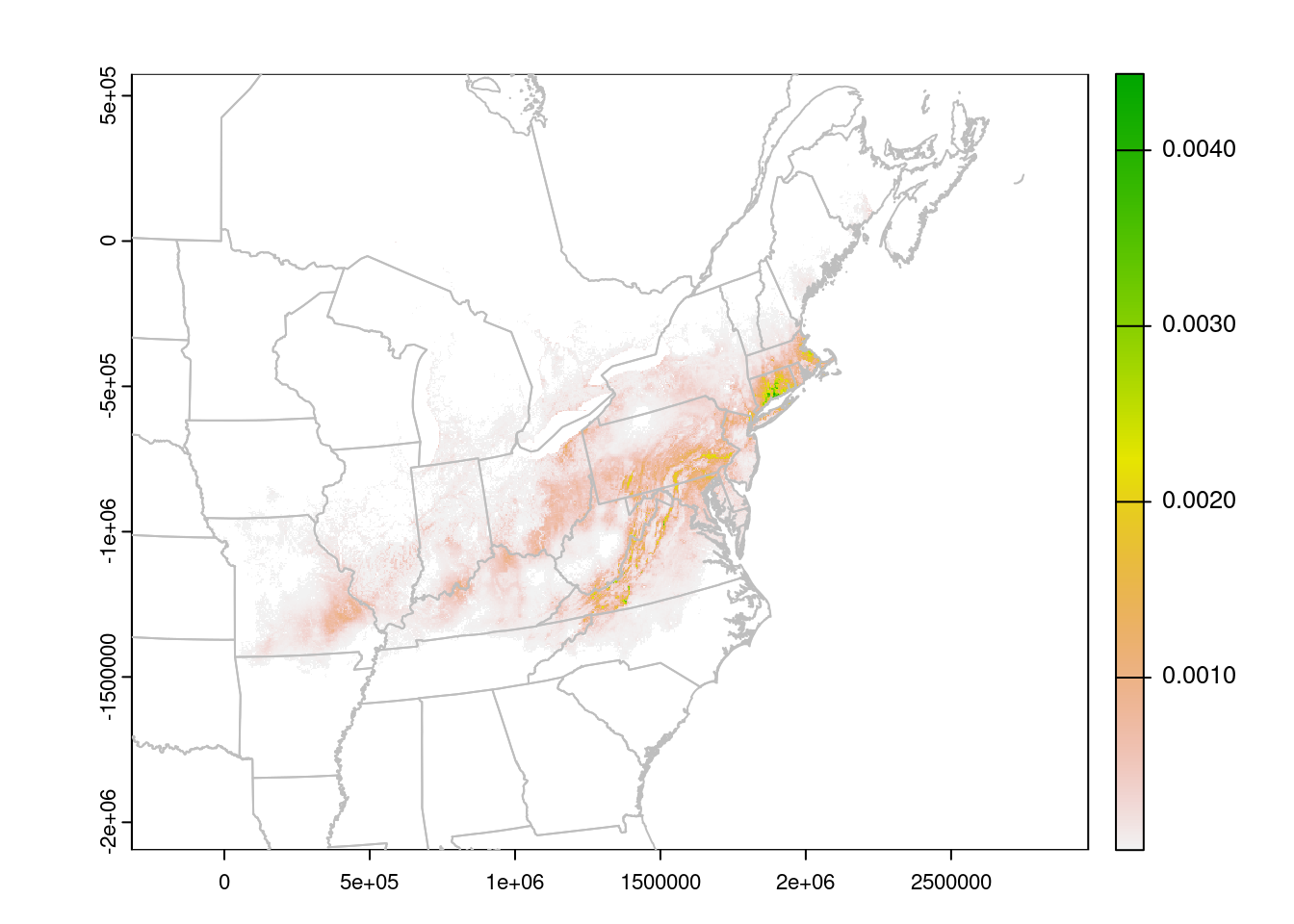
The units are no longer Lat/Lon, but meters. We can read them off the plot to improve the zoom:
plot(rasterLCC, xlim = c(0, 2500000),
     ylim = c(-1500000, -400000))
plot(CanUS.lcc, border = "grey", add = TRUE)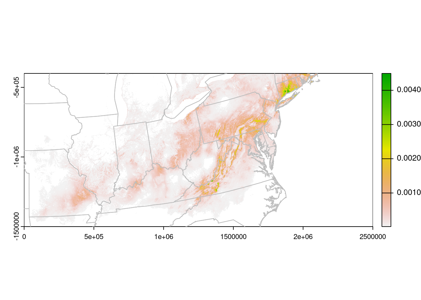
Formatting
With the data plotted, we can then turn to making the map a little
prettier. Note that when working with Spat* objects, we can’t set the
plot margins with par as we usually do. Instead, we use the mar
argument within the plot function:
## Make a panel with two plots
par(mfrow = c(1, 2))

## store the plot limits:
my_xlims <- c(0, 2500000)
my_ylims <- c(-1300000, -200000)

## Plot the points:
plot(CanUS.lcc, xlim = my_xlims , ylim = my_ylims,
     border = "grey", background = "lightblue",
     col = "white", axes = FALSE, mar = c(0.1,0.1,0.1,0))
plot(gl.lcc, add = TRUE, border = "grey", col = "lightblue")
points(gbif.lcc, pch = 16, col = alpha("grey30", 0.2),
       cex = 0.7)
box()

plot(CanUS.lcc, xlim = my_xlims , ylim = my_ylims,
     border = "grey", background = "lightblue",
     col = "white", mar = c(0.1,0,0.1,0.1), axes = FALSE)
plot(gl.lcc, add = TRUE, border = "grey", col = "lightblue")
plot(rasterLCC, add = TRUE, legend = FALSE, axes = FALSE)

## plotted again to put the border lines on top:
plot(CanUS.lcc, border = "grey", add = TRUE)
box()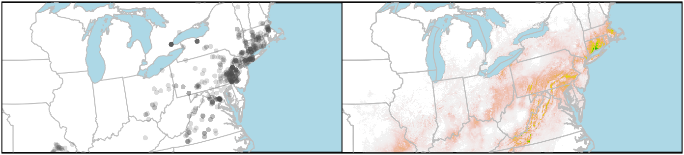
If you want to plot the state/provincial borders on top of the raster, you need to add those layers last. But you can’t set the background colour of the raster layer to “lightblue” (or at least I haven’t figured that out), so the ocean stays white. I get around that by plotting the boundaries twice, first to set the background colour, and then to put the state lines on top of the raster.