NOTE:
These are my working notes. For a general introduction to this technique, see my tutorial.
When comparing ranges (geographic or environmental) between two datasets
(e.g., the same species in different times/regions, to assess invasion
patterns), we can use the ecospat program to calculate indexes that
quantify expansion (area occupied in the invaded range but not the native),
stability (area occupied in both native and invaded), and infilling (area
occupied only in the native range, not the invaded). Note that depending on
the context, ‘native’ and ‘invaded’ may in fact refer to different species
being compared, rather than the same species being compared in different
contexts.
References
Using kernel density methods for estimating range size comes from a series
of papers by Worton: (Worton_1989?; Worton_1989a?; Worton_1995?). The
kernel density estimates are calculated using the adehabitatMA package
(Calenge_2006?). The theoretical approach is presented in
Broennimann et al. (2012), and implemented in the ecospat package
(Cola et al., 2017). (PhillipsElith_2010?) provides useful discussion, the niche
dynamic plots of ecospat are one form of what they refer to as
“Presence-Only Calibration Plots” (PCO-plots).
Setup
We need the ecospat, ade4, and raster packages for this analysis:
library(ecospat)
library(ade4)
library(raster)
Data Preparation
Required preliminary data are ordination scores for the total environment (i.e., the entire range of both species), the local environment (i.e., the ranges of each species of interest), and the PCA scores for each species of interest. The ordination space is defined by the background environment, the species scores are supplemental.
data(ecospat.testNiche)
data(ecospat.testData)

  ## The coordinates for two different species:
sp1 <- subset(ecospat.testNiche,
             Spp == levels(ecospat.testNiche$Spp)[1])
sp2 <- subset(ecospat.testNiche,
             Spp == levels(ecospat.testNiche$Spp)[2])

  ## The environmental data for 300 locations:
clim <- ecospat.testData[2:8]

  ## Add environmental data to species data:
sp1 <- cbind(sp1,
            na.exclude(
              ecospat.sample.envar(dfsp = sp1,
                                   colspxy = 2:3,
                                   colspkept = 1:3,
                                   dfvar = clim,
                                   colvarxy = 1:2,
                                   colvar = "all",
                                   resolution = 25)))

sp2 <- cbind(sp2,
            na.exclude(
              ecospat.sample.envar(dfsp = sp2,
                                   colspxy = 2:3,
                                   colspkept = 1:3,
                                   dfvar = clim,
                                   colvarxy = 1:2,
                                   colvar = "all",
                                   resolution = 25)))

##########################################################
## NB. `ecospat.sample.envar` samples from a data.frame ##
## of points, analogously to how `extract` samples from ##
## raster layer.                                        ##
##########################################################

  ## selection of variables to include in the analyses
Xvar <- c("ddeg", "mind", "srad", "slp", "topo")
nvar <- length(Xvar)

pca.cal <- dudi.pca(clim[, Xvar], center = TRUE,
                   scale = TRUE, scannf = FALSE, nf = 2)

  ## Species scores:
sp1.scores <- suprow(pca.cal, sp1[, Xvar])$li
sp2.scores <- suprow(pca.cal, sp2[, Xvar])$li
scores.clim <- pca.cal$li

  ## scores.sp1 and scores.sp2 now contain the position of
  ## these two species in the environmental ordination
  ## space.
Let’s take a look at the starting data:
plot(scores.clim, pch = 16, asp = 1,
     col = adjustcolor(1, alpha.f = 0.2), cex = 2,
     xlab = "PC1", ylab = "PC2")
points(sp1.scores, pch = 17, col = 2, cex = 2)
points(sp2.scores, pch = 18, col = 4, cex = 2)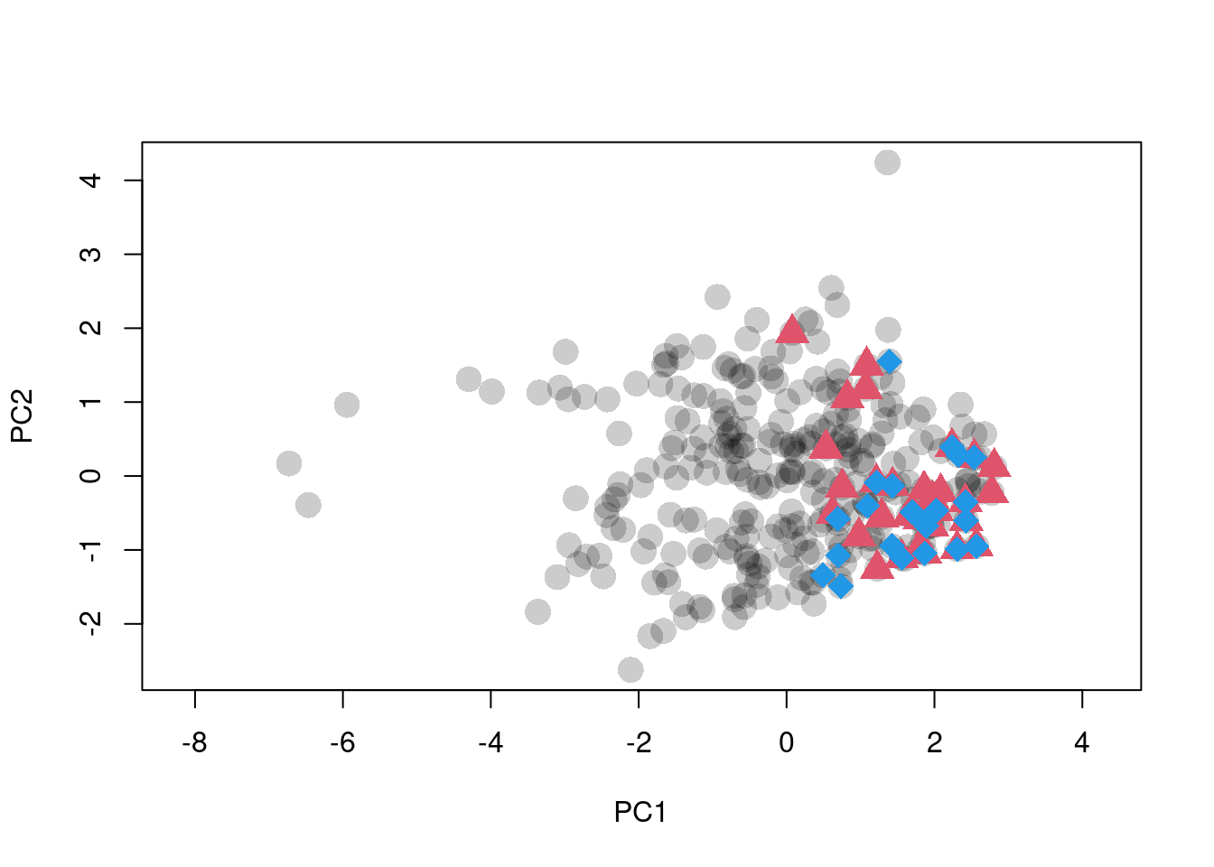
Figure 1: Ordination of raw climate data. Black dots are background points. Red triangles and blue diamonds are species occurences.
Kernel Density Estimates
Next we create the occurence density grids for the two species we wish to
compare. These grids are called gridclim objects in the ecospat
documentation (not really objects in the R sense, just lists).
We feed the ordination data to ecospat.grid.clim.dyn to get the actual
grids:
z1 <- ecospat.grid.clim.dyn(scores.clim, scores.clim,
                            sp1.scores, R = 100)
## Registered S3 methods overwritten by 'adehabitatMA':
## method from
## print.SpatialPixelsDataFrame sp
## print.SpatialPixels spz2 <- ecospat.grid.clim.dyn(scores.clim, scores.clim,
sp2.scores, R = 100)This does the following:
- the extent is set to the limits of the global environment
- the kernel density of the local environment is estimated
- the kernel density of the species occurence environment is estimated
Various transformations and corrections are applied to these estimates. The list that is returned contains:
- x, y : the coordinates for each cell in the resulting density plot
- z : the occurence density estimate for each cell in the plot, scaled to the total number of occurences in the raw data
- z.uncor : z scaled to 0-1. i.e., the density estimate for a cell is a direct reflection of the number of occurences in the vicinity of that cell, regardless of the environmental distribution.
- z.cor : z corrected for environmental prevalence i.e., we take the density estimate, and divide by the relative abundance of the environment at that location. Effectively, we need more occurences at common environments to achieve the same density estimate as a smaller number in a rare environment.
- Z : the home/local environment density estimate for each cell in the plot, scaled to the total number of rows in the raw environment data (background)
- w : the “niche envelope”, which is
z.uncorconverted to a presence-absence map (all values > 0 become present). - glob, glob1, sp : the coordinates of all observations in the raw global environment, raw local environment, and species occurence data
The key outputs are z.uncor and z.cor. We can compare these with a few
plots:
par(mfrow = c(2, 2), mar = c(0.5, 0.5, 2, 0))
plot(z1$z.uncor, legend = FALSE, axes = FALSE,
     main = "z.uncor - Full")
points(z1$sp, pch = 16, col = adjustcolor(1, alpha.f = 0.5))
plot(z1$z.cor, legend = FALSE, main = "z.cor - Full",
     axes = FALSE)
points(z1$sp, pch = 16, col = adjustcolor(1, alpha.f = 0.5))
plot(z1$z.uncor, xlim = c(0, 3), ylim = c(-2, 2),
     axes = FALSE, legend = FALSE, main = "z.uncor - Zoom")
points(z1$sp, pch = 16, col = adjustcolor(1, alpha.f = 0.5))
plot(z1$z.cor, xlim = c(0, 3), ylim = c(-2, 2), axes = FALSE,
     legend = FALSE, main = "z.cor - Zoom")
points(z1$sp, pch = 16, col = adjustcolor(1, alpha.f = 0.5))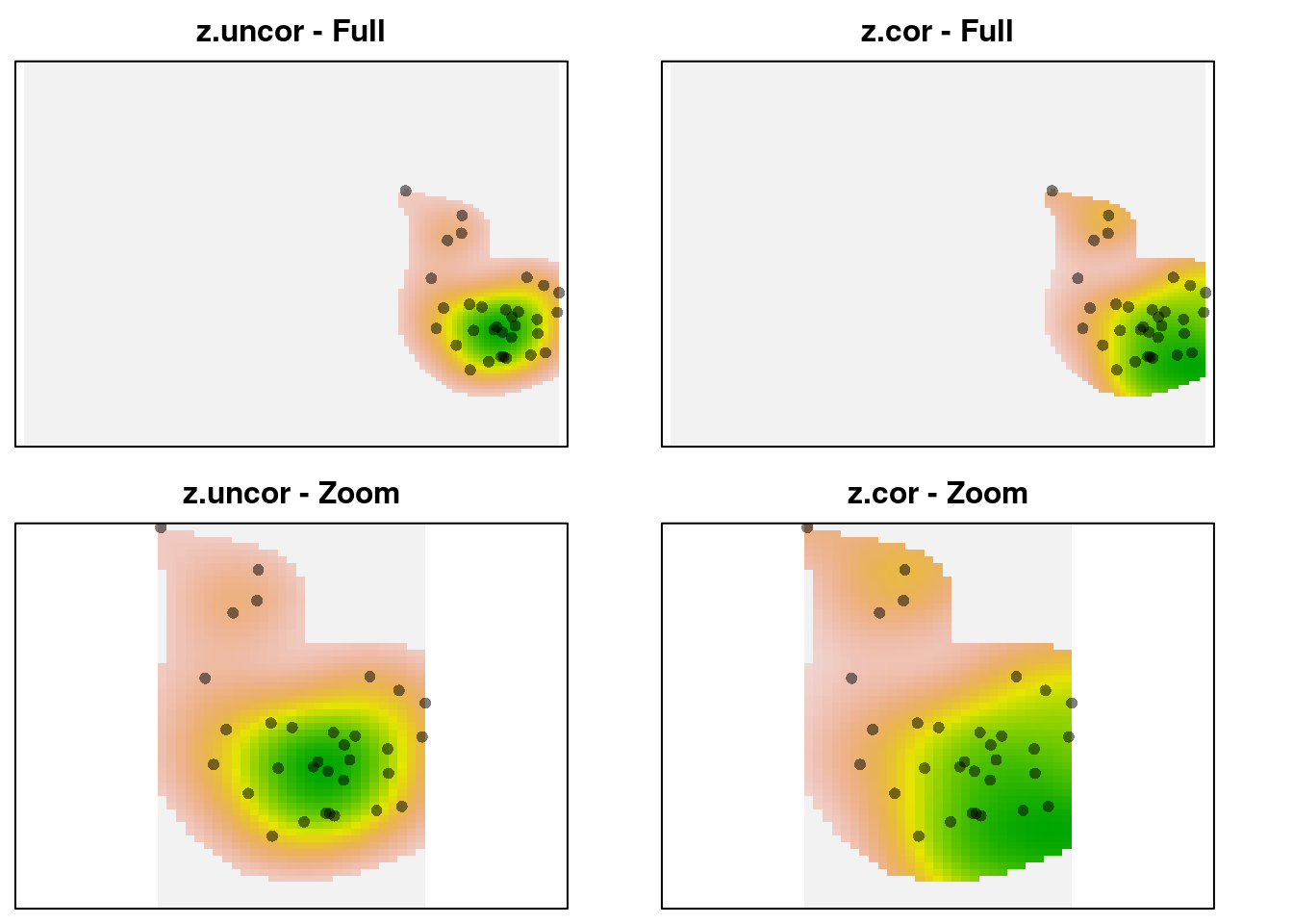
We can see that z-uncor looks like we expect. The observations are
arranged in a circular cloud, which is captured as a circular-shaped kernel
density. In contrast, z.cor shows a higher kernel density estimate in the
lower right corner, despite using the same observations. The reason is that
the observations in the lower right occur in rarer environments, so they
are given higher relative weight in the density estimate. Here’s the
environmental density:
plot(z1$Z, axes = FALSE, legend = FALSE,
     main = "Environmental density - Full")
points(z1$sp, pch = 16, col = adjustcolor(1, alpha.f = 0.5))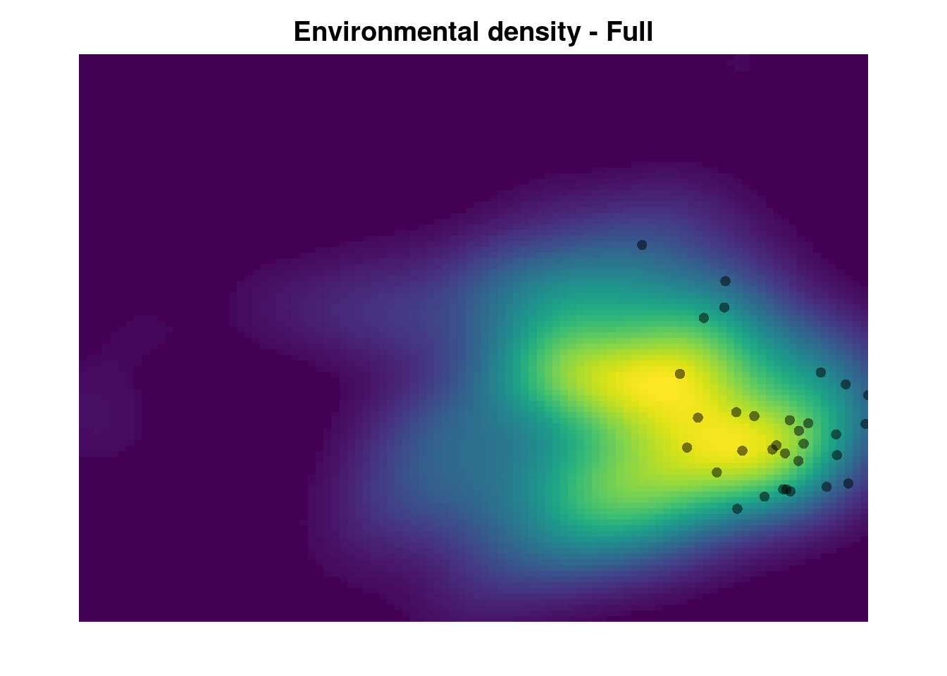
The green area shows the most common environments. The observations within this area are given reduced weight relative to the observations in rare environments (the pink areas on the margin). This creates the ‘skew’ in the corrected occurence density kernel.
Kernel Density Calculation
Taking a closer look:
The kernel densities are generated from:
glob1.dens <- ecospat.kd(x = glob1, ext = ext,
                         method = kernel.method, th = 0)
where glob1 is the environmental background fro species 1, ext a vector
with min and max values for each PC axis, and kernel.method is set to
adehabitat by default, sends the data to adehabitatHR::kernelUD. Let’s
extract all the relevant code:
R <- 100 # grid size
xmin <- apply(scores.clim, 2, min, na.rm = T)
xmax <- apply(scores.clim, 2, max, na.rm = T)
ext <- c(xmin[1], xmax[1], xmin[2], xmax[2])

## Scale the raw coordinates to 0-1:
xr <- data.frame(
  cbind(
  (scores.clim[, 1] - ext[1]) / abs(ext[2] - ext[1]),
  (scores.clim[, 2] - ext[3]) / abs(ext[4] - ext[3])))

mask <- adehabitatMA::ascgen(
                       sp::SpatialPoints(cbind((0:(R)) / R,
                       (0:(R) / R))), nrcol = R - 2,
                       count = FALSE)

x.UD <- adehabitatHR::kernelUD(sp::SpatialPoints(xr[, 1:2]),
                                h = "href", grid = mask,
                                kern = "bivnorm"
                                )

## Shift the density back to match the original projection:
x.dens <- raster::raster(
                   xmn = ext[1], xmx = ext[2], ymn = ext[3],
                   ymx = ext[4], matrix(x.UD$ud, nrow = R)
                 )

plot(x.dens)
points(scores.clim)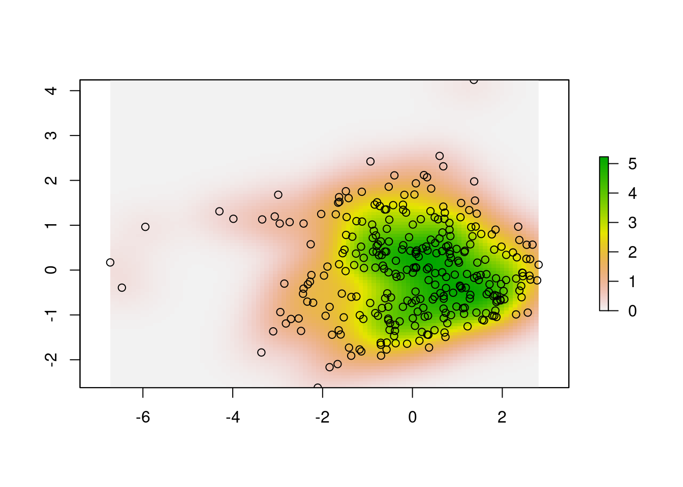
We can’t alter the arguments passed to kernelUD, which are set to h = "href" (the smoothing parameter), and kern = "bivnorm" (the kernel
function). From (Worton_1989?), the kernel function isn’t as important as the
smoothing parameter. The actual combination chosen depends on the needs of
the study. There is an unavoidable tradeoff between simple, general
estimates, show the overall pattern of distribution, but at the cost of
‘smoothing away’ data in the tails, vs more accurate models that retain
information in the tails, but may over-emphasize the importance of noise in
the data.
We could use either the ad hoc smoothing parameter (the default, “href”), or the least-squares cross-validation smoother (“LSCV”). How much difference would it make:
x.dens.ls <-
  adehabitatHR::kernelUD(sp::SpatialPoints(xr[, 1:2]),
                         h = "LSCV", grid = mask,
                         kern = "bivnorm")
x.dens.ls <-
  raster::raster(xmn = ext[1], xmx = ext[2], ymn = ext[3],
                 ymx = ext[4], matrix(x.dens.ls$ud,
                                      nrow = R))

#dev.new(width = 6, height = 8)

par(mfrow = c(2, 2), mar = c(2, 0.1, 3, 0))
plot(x.dens, main = "Ad Hoc", legend = FALSE, axes = FALSE)
points(scores.clim, pch = 16, cex = 0.5,
       col = adjustcolor("black", alpha.f = 0.1))
plot(x.dens.ls, main = "LSCV", legend = FALSE, axes = FALSE)
points(scores.clim, pch = 16, cex = 0.5,
       col = adjustcolor("black", alpha.f = 0.1))

plot(x.dens, main = "Ad Hoc", legend = FALSE, axes = FALSE,
     xlim = c(-1, 2), ylim = c(-1, 1))
plot(x.dens.ls, main = "LSCV", legend = FALSE, axes = FALSE,
     xlim = c(-1, 2), ylim = c(-1, 1))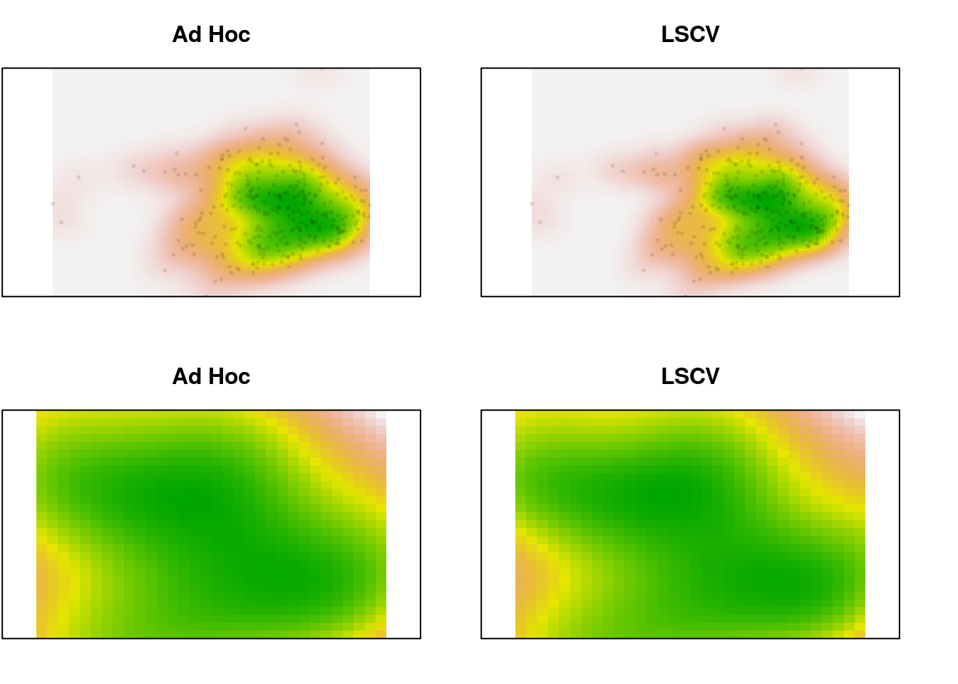
In the zoomed image, we can see a bit more definition in the LSCV density estimate, but it’s a very slight difference. In this case, there is a lot of data. What happens for the species data, which is sparser?
## Shift the raw data to match the extent:
spec1r <- data.frame(
  cbind(
  (sp1.scores[, 1] - ext[1]) / abs(ext[2] - ext[1]),
  (sp1.scores[, 2] - ext[3]) / abs(ext[4] - ext[3])))

sp1.dens <- adehabitatHR::kernelUD(sp::SpatialPoints(spec1r[, 1:2]),
                                h = "href", grid = mask,
                                kern = "bivnorm")
sp1.dens <- raster::raster(
                     xmn = ext[1], xmx = ext[2], ymn = ext[3],
                     ymx = ext[4], matrix(sp1.dens$ud, nrow = R))

sp1.dens.ls <- adehabitatHR::kernelUD(sp::SpatialPoints(spec1r[, 1:2]),
                                   h = "LSCV", grid = mask,
                                   kern = "bivnorm")
sp1.dens.ls <- raster::raster(
                      xmn = ext[1], xmx = ext[2], ymn = ext[3],
                      ymx = ext[4], matrix(sp1.dens.ls$ud,
                      nrow = R))

par(mfrow = c(2, 2), mar = c(2, 0.1, 3, 0))
plot(sp1.dens, main = "Ad Hoc", legend = FALSE, axes = FALSE)
points(sp1.scores, pch = 16, cex = 0.5,
       col = adjustcolor("black", alpha.f = 0.1))
plot(sp1.dens.ls, main = "LSCV", legend = FALSE, axes = FALSE)
points(sp1.scores, pch = 16, cex = 0.5,
       col = adjustcolor("black", alpha.f = 0.1))
plot(sp1.dens, main = "Ad Hoc", legend = FALSE, axes = FALSE,
     xlim = c(-1, 1), ylim = c(1, 2.5))
points(sp1.scores, pch = 16, cex = 0.5,
       col = adjustcolor("black", alpha.f = 0.1))
plot(sp1.dens.ls, main = "LSCV", legend = FALSE, axes = FALSE,
     xlim = c(-1, 1), ylim = c(1, 2.5))
points(sp1.scores, pch = 16, cex = 0.5,
       col = adjustcolor("black", alpha.f = 0.1))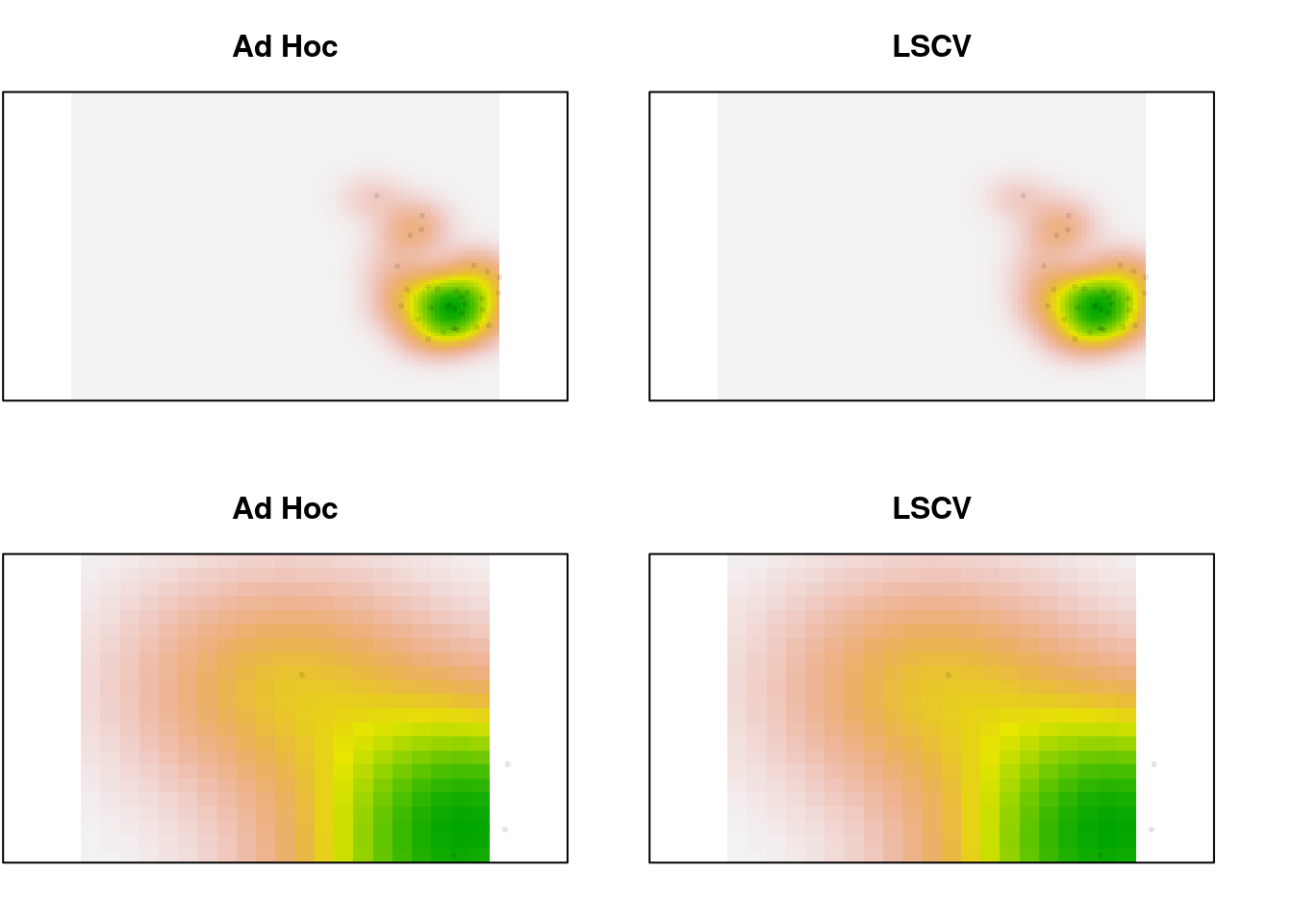
Not much difference, even with 32 points. Trim it to just the first 10 and look again:
sp1.trim <- sp1.scores[1:7, ]
trimr <- data.frame(
  cbind(
  (sp1.trim[, 1] - ext[1]) / abs(ext[2] - ext[1]),
  (sp1.trim[, 2] - ext[3]) / abs(ext[4] - ext[3])))

trim.dens <-
  adehabitatHR::kernelUD(sp::SpatialPoints(trimr[, 1:2]),
                         h = "href", grid = mask,
                         kern = "bivnorm")
trim.dens <-
  raster::raster(xmn = ext[1], xmx = ext[2], ymn = ext[3],
                 ymx = ext[4], matrix(trim.dens$ud, nrow = R))

trim.dens.ls <-
  adehabitatHR::kernelUD(sp::SpatialPoints(trimr[, 1:2]),
                         h = "LSCV", grid = mask,
                         kern = "bivnorm")
trim.dens.ls <- raster::raster(
                      xmn = ext[1], xmx = ext[2], ymn = ext[3],
                      ymx = ext[4], matrix(trim.dens.ls$ud,
                      nrow = R))

par(mfrow = c(2, 2), mar = c(2, 0.1, 3, 0))
xlims <- c(0, 5)
ylims <- c(-1, 2)
plot(trim.dens, main = "Ad Hoc", legend = FALSE, axes = FALSE)
points(sp1.trim, pch = 16, cex = 1,
       col = adjustcolor("black", alpha.f = 0.4))
plot(trim.dens.ls, main = "LSCV", legend = FALSE, axes = FALSE)
points(sp1.trim, pch = 16, cex = 1,
       col = adjustcolor("black", alpha.f = 0.4))
plot(trim.dens, main = "Ad Hoc", legend = FALSE, axes = FALSE,
     xlim = xlims, ylim = ylims)
points(sp1.trim, pch = 16, cex = 1,
       col = adjustcolor("black", alpha.f = 0.4))
plot(trim.dens.ls, main = "LSCV", legend = FALSE, axes = FALSE,
     xlim = xlims, ylim = ylims)
points(sp1.trim, pch = 16, cex = 1,
       col = adjustcolor("black", alpha.f = 0.4))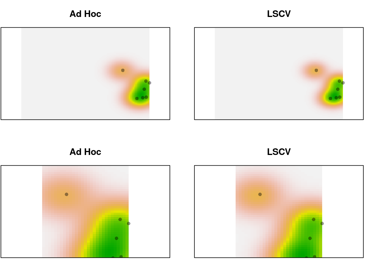
Still a pretty subtle difference, even with only 10 points.
Niche expansion, stability, and unfilling
Once we have our grids, we proceed to calculate the dynamic niche indices.
Assume we’re comparing two species, sp1 and sp2, each with their own
‘native’ environment env1 and env2. The global environment globenv is
just env1 and env2 combined. In the case of species with the same range
(i.e., comparing 2 North American species), env1 = env2 = globenv.
We have all the grids available now: w, z.cor, z.uncor, Z, for both
species, in the results returned by ecospat.grid.clim.dyn. We can pass
this on to ecospat.niche.dyn.index to generate the metrics of interest:
ind1 <- ecospat.niche.dyn.index(z1, z2)The first step in this process is categorizing each cell in the ordination as expansion, stability, or unfilling. This is determined using only the presence/absence layers, w:
## Convert to matrices to allow us to do logical operations:
w1 <- as.matrix(z1$w)
w2 <- as.matrix(z2$w)

stability <- w1 & w2   ## both present
expansion <- w2 & ! w1 ## only sp2 present
unfilling <- w1 & ! w2 ## only sp1 present

## Combine: expansion = 1, unfilling = 2, stablility = 3)
dyn.index <- expansion + (2 * unfilling) + (3 * stability)

## rotate the matrix so the image is oriented properly:
dyn.index <- t(apply(dyn.index, 2, rev))

## visualize:
image(dyn.index, col = c("#FFFFFF", "red", "blue", "green"),
      axes = FALSE)
box()![]()
For visualization, we can do this all in one operation:
cr <- colorRampPalette(c("white", "red", "green", "blue"))
plot(2*z1$w+z2$w, col = cr(4))
points(z1$sp, pch = 21, bg = "green", col = 1)
points(z2$sp, pch = 21, bg = "red", col = 1)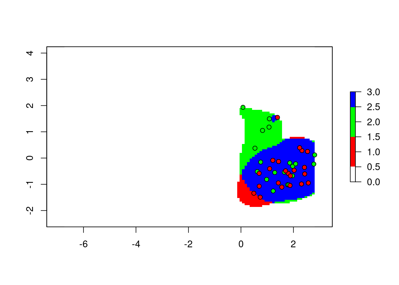
To explain this trick: we add the two maps together, with the first map counting twice. The result is, any cell with the value 1 means only the corresponding cell in the second map was occupied. 2 means only the first map is occupied. 3 is both maps occupied.
Computation aside, the categorization of pixels is straightforward to interpret.
But wait! We can’t just sum up the different categories to get our indices. Each cell is weighted before we compute the indices. Applying the same trick, the calculations proceed as follows:
## Create a raster with the classified pixels:
dyn.raster <- 2*z1$w+z2$w

## Extract the three categories:
exp.raster <- dyn.raster == 1
unfill.raster <- dyn.raster == 2
stab.raster <- dyn.raster == 3

## Compute their weights:
exp.weighted <- z2$z.uncor * exp.raster
## stability also weighted by species 2:
stab.weighted <- z2$z.uncor * stab.raster
## unfilling weighted by species 1:
unfill.weighted <- z1$z.uncor * unfill.raster
## but we need stability weighted by species 1 too:
stab1.weighted <- z1$z.uncor * stab.raster

## Calculate indices:

expansion.index <- sum(getValues(exp.weighted)) /
  sum(getValues(exp.weighted + stab.weighted))

stability.index <- sum(getValues(stab.weighted)) /
  sum(getValues(exp.weighted + stab.weighted))
## alternatively, 1 - expansion.index

unfilling.index <- sum(getValues(unfill.weighted)) /
  sum(getValues(unfill.weighted + stab1.weighted))
And the values I get from my re-implementation of ecospat match exactly:
My indices: Expansion: 0.060, Stability: 0.940, Unfilling: 0.136
Ecospat indices: Expansion: 0.060, Stability: 0.940, Unfilling: 0.136